There is an old adage says that a picture is worth a thousand words. I take that motto to heart. Years ago I had the idea that I wanted to display the physical locations of objects on a topographical map. This way we could show where assets are and where people work. After all, the first word in Information Technology is Information. Based on that same map, we could then expand upon that and use some intelligence to find out what tools and software people used. In the end, using that information you can then have a better conversation about how to improve the end user experience.
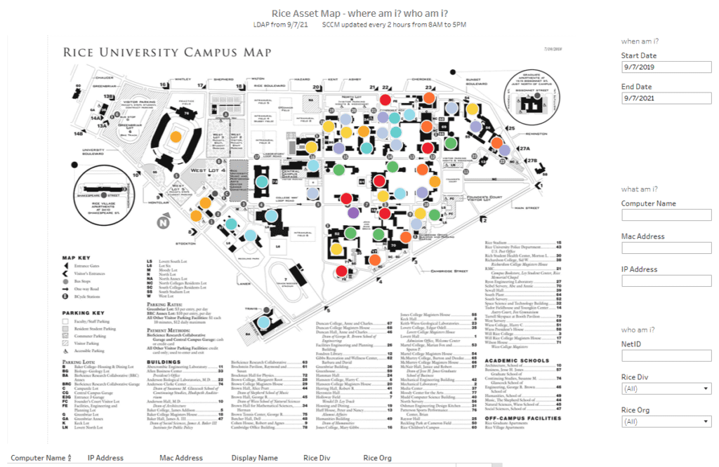
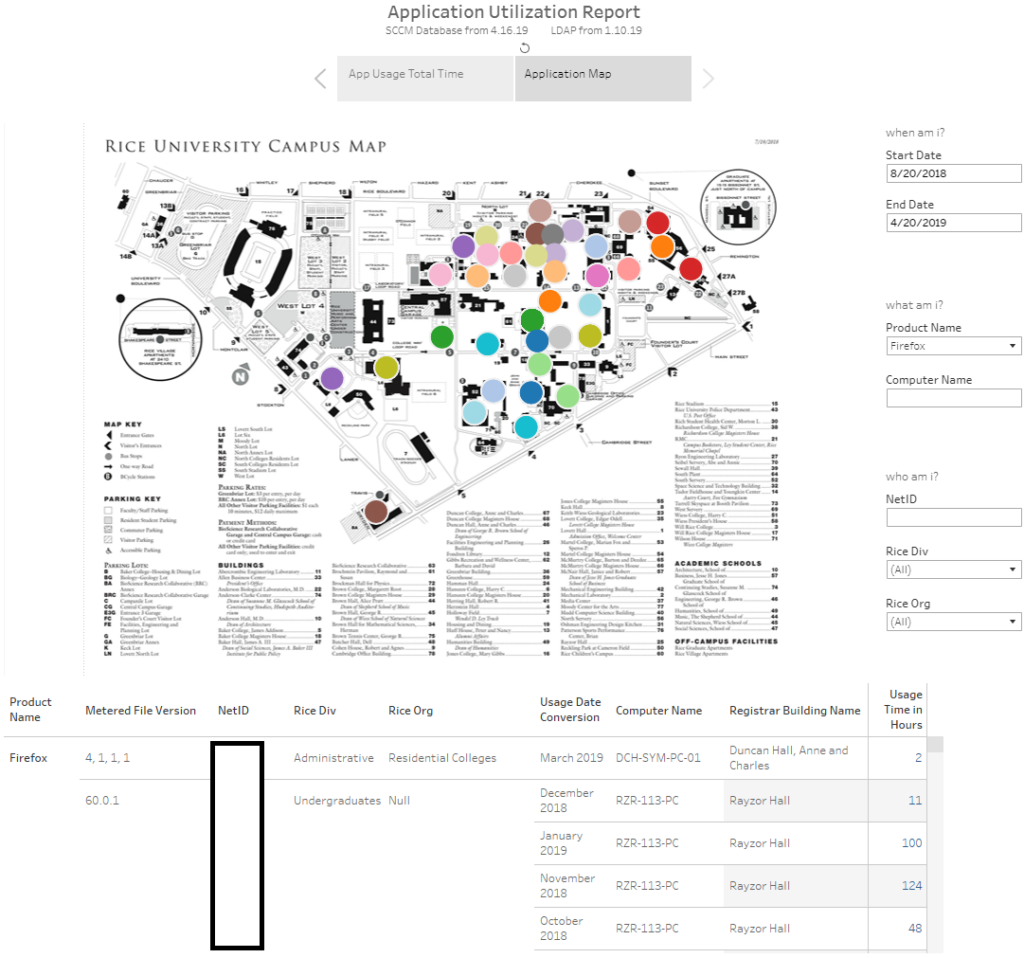
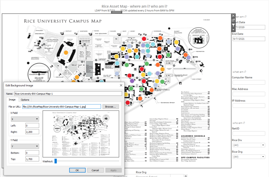
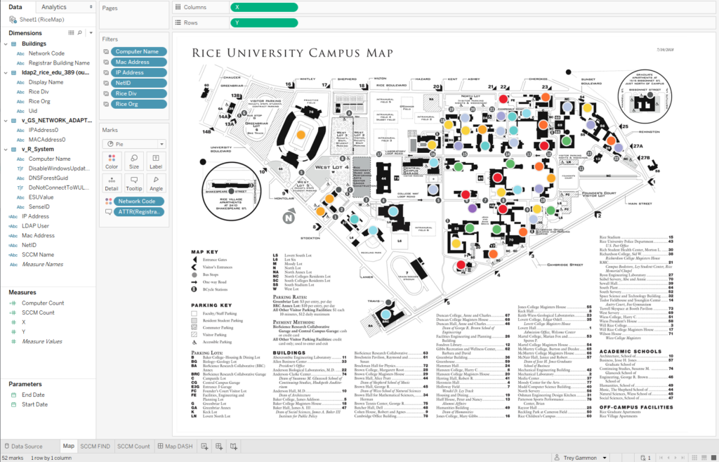
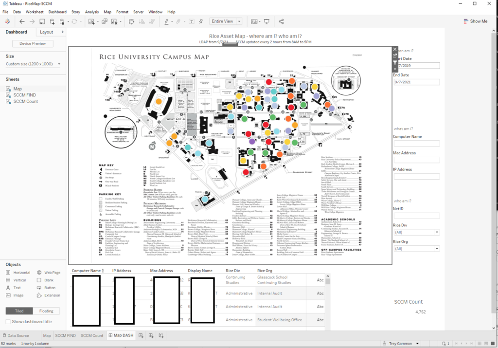
The short version is that I combined elements of SCCM, LDAP, Networking, Excel, a topographic map, and Tableau. Here is an example of what you can you do when you put those different components together. You can do dynamic searches for people or things such as IP addresses, mac addresses, and computer names. It is filterable by the fields on the right hand side as well as by clicking on the building itself. Also, if you hover over any of the buildings it will list the building related information.
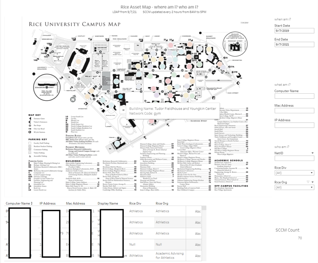
One example is that you can list the associated computers and users of a building. The Tableau tooltip will display building related information when we hover over it. We use building name which is the registrar’s official name of a building and the network code which is what is programmed into the building switches. This method is handy for a variety of reasons from compliance to notification. You can even use it to dungeon crawl from machine to machine if you had to manually correct something.
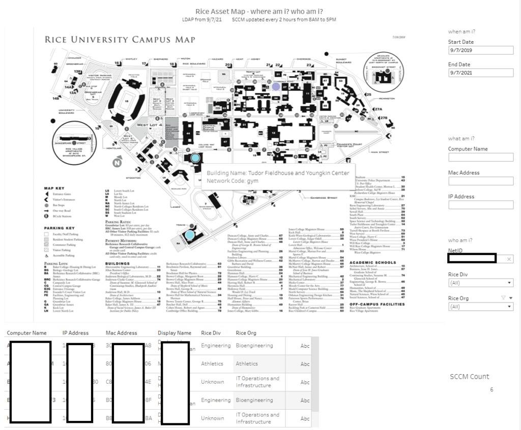
Another example is a search for a specific person which is based on a user ID. As you can see, that person is associated with 3 different buildings. Based on the SCCM criteria of a primary user, that means that they have been logged into computers that are now in those 3 different buildings for a minimum of 30 minutes within the past 90 days.
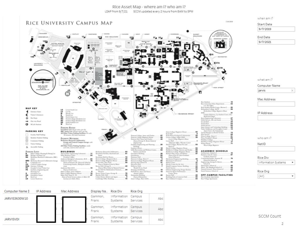
You can even do dynamic searches based on a partial computer name. In this case, all machines with the word jarvis in them. Yes, I am an Iron Man nerd. As you can tell the machines are not showing up on the map because one is a VDI and one is my main system that I am using from home during the pandemic. However, it will still list the assets associated with me and if they were on the campus grounds based on the IP address.
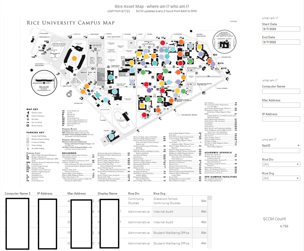
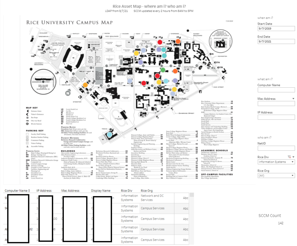
Let’s try something else. What if we want to see all of the buildings and related computers to those that work for IT? No problem.
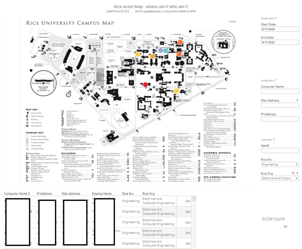
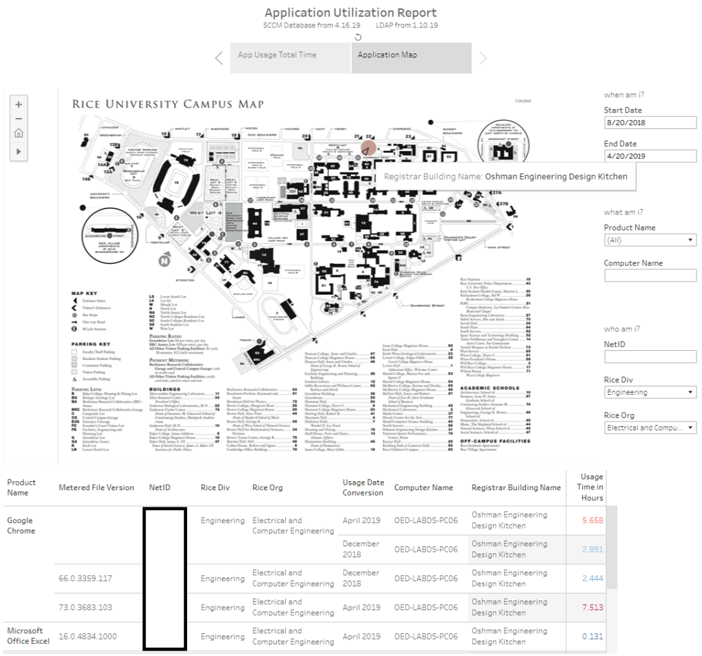
Ok, what if we want to find a more niche area such as all students that have declared majors as Electrical and Computer Engineering. Where do they use computers at? Are they in one location or multiple locations?
You get the idea. Now we can make sure that the hardware and the software are where they need to be.
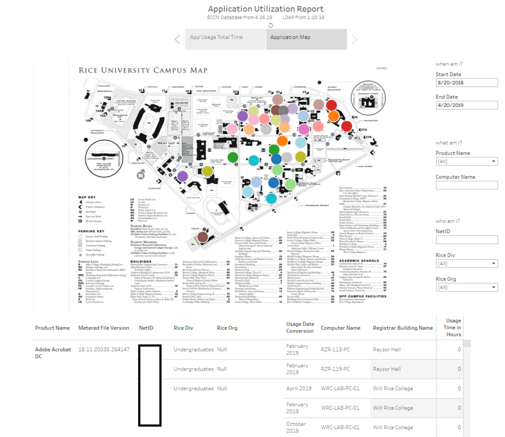
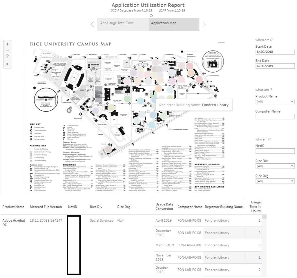
You can even use this same framework to apply it to software metering. Once you have that enabled within SCCM, you can then display that information as well. Here is an example where the buildings that are colored have application metering utilization enabled. You can filter by clicking the building to see the usage or by more selective targeting via the right side options. Please note, I have not updated this report since 2019 as this was a proof of concept I designed, but you get the idea.
Ok, let’s say you want to see what software is being used in a public location like the Library. Maybe you want to dig deeper to see what associations there are between a location and a software title. Perhaps you can adjust licensing costs for it and use the cost savings for another area that needs it. Perhaps you can reduce your license count and even add additional computers or migrate to a virtual environment depending on the demand.
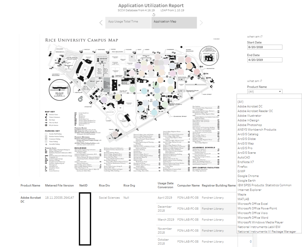
That’s handy. What if we want to find out what software is used in each location. You can do that. Here you can see the software titles that are being metered for utilization.
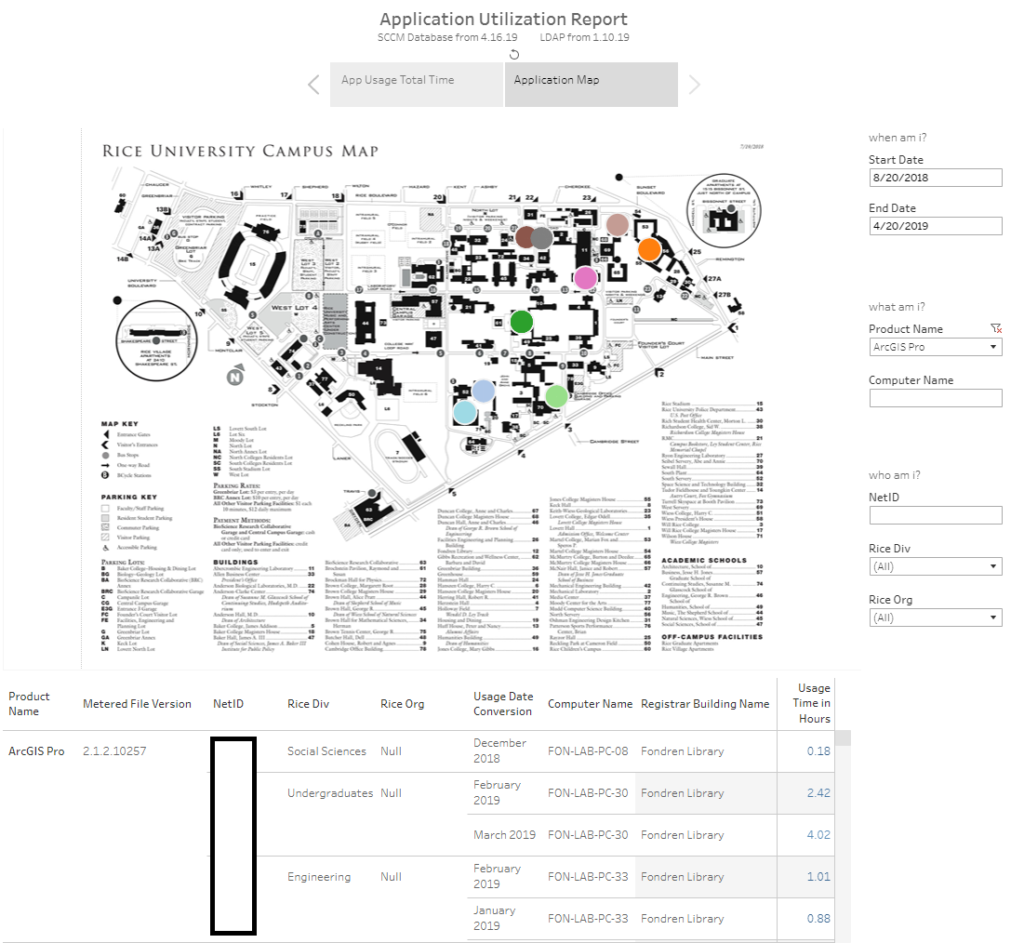
While there are many site licensed applications, let’s find out where ArcGIS is being used. Here you can see that title is being used at 9 different locations.
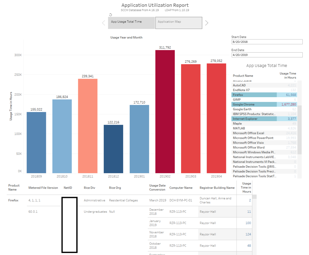
What about a popular application like Google Chrome? Is it used more than Mozilla Firefox? What about Internet Explorer? What are end users choosing?

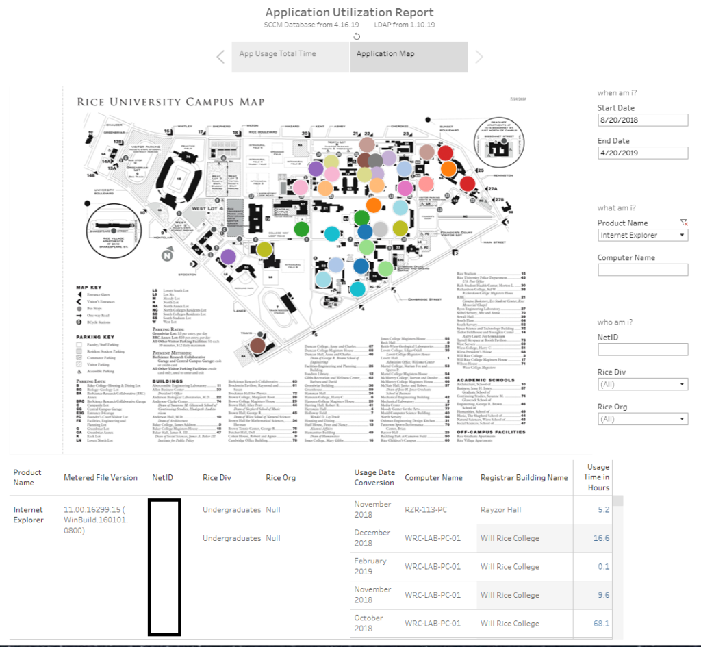
It looks like all 3 web browsers are used everywhere, but without diving deeper it appears that Google Chrome is used for longer periods of time while Mozilla Firefox is the second most popular and Internet Explorer rounds out the pack. However, if we dig deeper into the usage time, we can see the following.
But I digress. Remember the earlier example about where the Electrical and Computer Engineering majors were? What about if we want to see their utilization on a map?
Hopefully, you can see the possibilities of how visualizing information can help to improve the end user’s experience via licensing, additional computing resources, etc.
So how to make it?
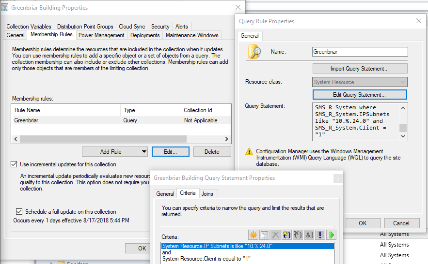
For SCCM, I used collections that were setup to automatically update their memberships based on certain subnets. For example, if a computer (which has ConfigMgr installed) was moved in or out of a building it would update it’s IP address accordingly and would move to the proper collection. Each collection was named based on the registrar’s building name code which then cross referenced against networking’s list for the subnets.
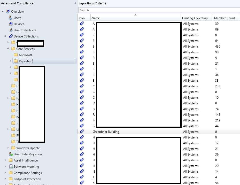
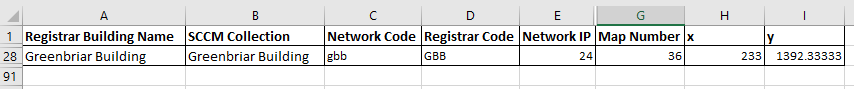
In this case, the Greenbriar Building has been decommissioned, but its automatic criteria is the following.
We use LDAP rather than Active Directory as our authoritative source of information. For LDAP, I used the free tool, Softterra LDAP Browser and using a service account, I was able to export a list of the People and Groups from our LDAP servers. This is important as you need to match up the uid from LDAP to the primary user that is collected inside SCCM after a certain period of time. Also, that same uid will give you additional information such as the Organization or Division they are in as well as other contact related information. Later on, this let’s you do abstract queries on the map such as all users that are in a certain division. This way you can then find where they have assets at or where they work at. This is useful for end users that work in multiple locations so that you can help them more efficiently.
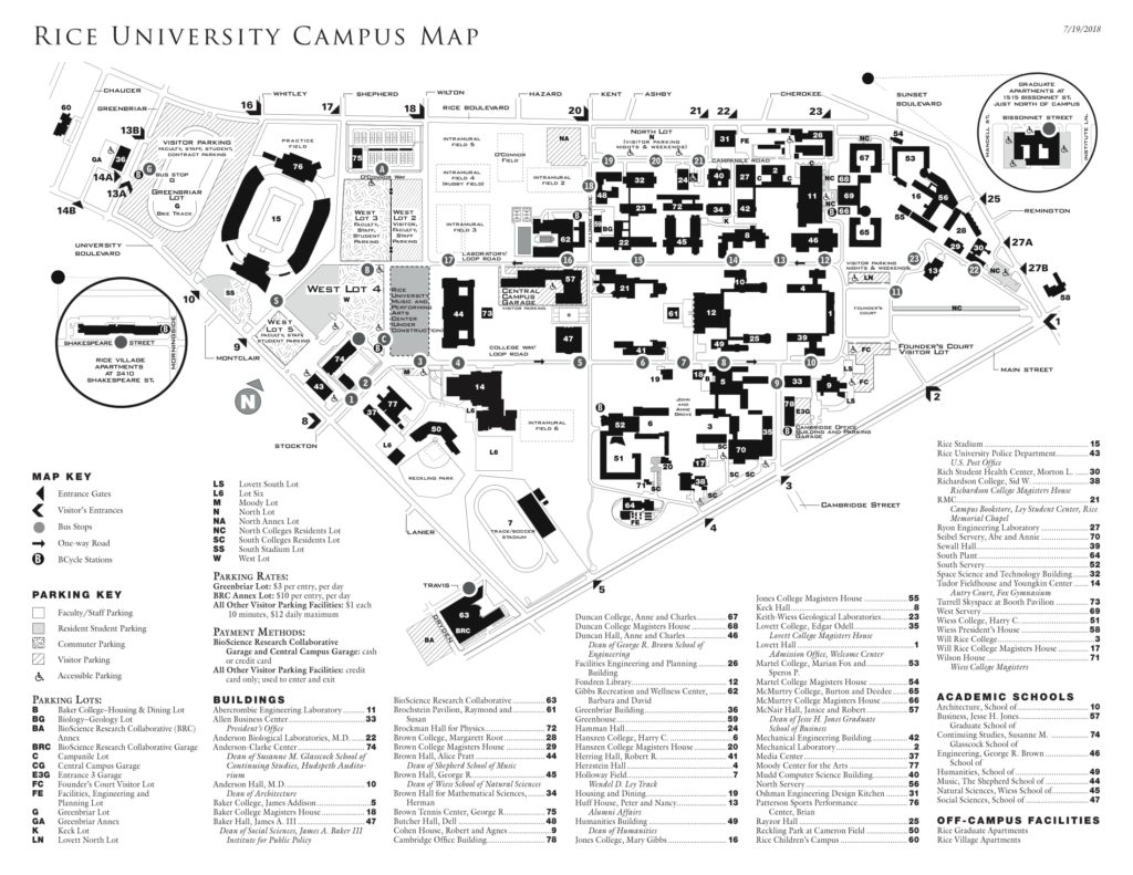
For the topographic map, it took time to find the right map at the right resolution. Once I found the right image, I saved it in grayscale so that there was no color. That way when I used Tableau to overlay on top, the colors would be more vibrant and stand out.
You can import the map to http://drawingtool.powertoolsfortableau.com/ and save it as an excel file.
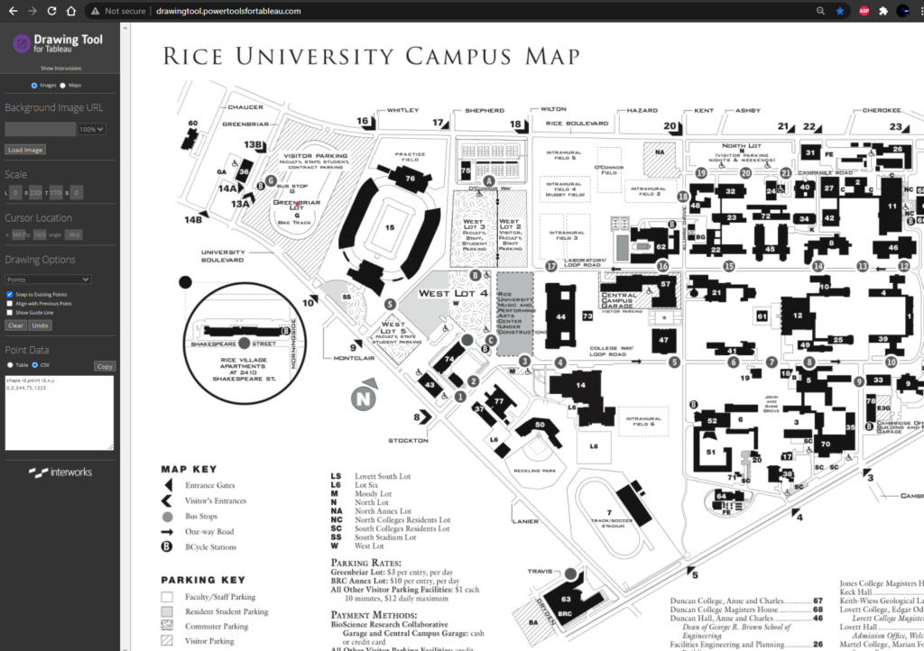
Make sure to look at the Map Image properties and find the resolution. Then, start Tableau and add the Excel file as a datasource. You will use the X and Y coordinates as the columns and rows. This is important as you will match up those coordinates with a spreadsheet with the building names that are the Collections inside SCCM. Cool right? In the Map Menu, add the image and change the X and Y limit to the resolution of the image. If necessary, uncheck Aggregate Measures inside the Analysis Menu.
For Excel, I modified the spreadsheet we made so that the X and Y coordinates matched up to the building name, the networking naming convention prefix, and the network subnets.
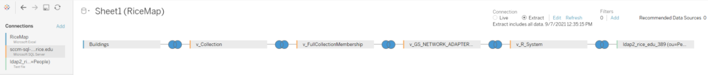
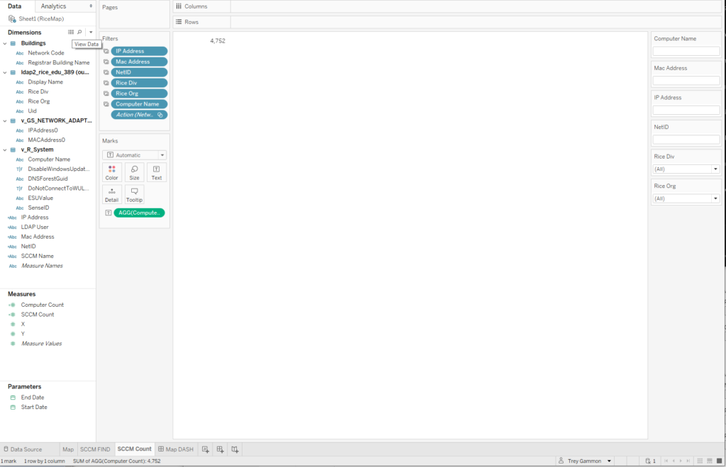
In the end, your connections inside Tableau will look like the following.
I used three worksheets and 1 dashboard. The first is the map. which will be at the top of our dashboard
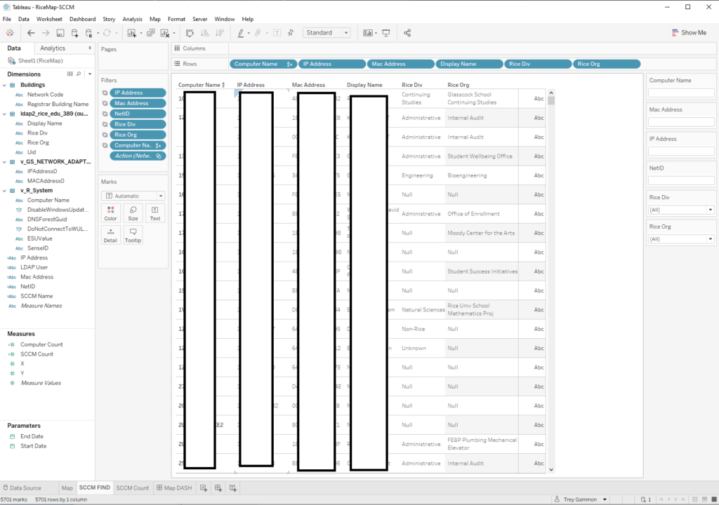
Next, I made the display for the bottom of the dashboard that will be used to show computer and user information.
The third sheet is the total count of assets inside SCCM.
And finally, the dashboard all laid out.
And that’s about it. It took awhile to figure out how to put it all together, but you can then use these concepts to expand upon as needed. For this proof of concept, I was able to show the senior leadership the benefits of how we could make IT better. Hopefully, this can help you to improve information for your organization too.