TL;DR: I added 1,400+ Datacenters to the WhereTo mobile app, but then decided to keep going and spent the past few weeks completely redesigning it to make it free for all public, civic, and environmental information. I also redesigned the map engine for performance and stability and user customizations. Has a single button to give you dozens of information about any location at a quick glance.
There has been so much talk on Datacenters lately. Billions of dollars, trillions of gallons of water usage, and numerous people for and against. It was pointed to me that Erin Brockovich wanted to share that information to people. Transparency resonates with me so I wanted to see if it was possible. It turns out it is and there is an open source datasource for it. Since I am a visual guy and love to see data, I put it into a geojson format and mapped it out so that it can be seen on a map easier. A picture is worth a thousands words after all.
However, then as I was adding in the feature I decided that I was hit with a strong desire to modify the direction of WhereTo. Originally, it was an attempt to visualize data for deciding where to live. It started years ago with spreadsheets that became Tableau dashboards and eventually became a full fledged application.
What I have learned is that the original story is a snapshot in time and representative of an idea, but that the actions afterwards are mutable and can change over time. Within that span, there is always the crux of an element that gets sharpened and refined. In the case of WhereTo, it was about finding location intelligence around you, but as I added in more layers the data changed from good restaurants, houses, and jobs to what is the dirt like under my feet? Is the air quality any good? Is the area too loud to live in?
I made an article and videos, but if you are interested, please give it a go and let me know what you think. I would especially like to get your thoughts on additional pieces of information to add in or current features to modify.
iOS: https://apps.apple.com/us/app/whereto-by-ideasquantified/id6737565059
Android: https://play.google.com/store/apps/details?id=com.ideasquantified.whereto&hl=en_US
Info: https://www.ideasquantified.com/whereto/
Original Demo: https://www.ideasquantified.com/whereto-from-ideasquantified/
#whereto #ideasquantified #datacenter #ios #android #maps
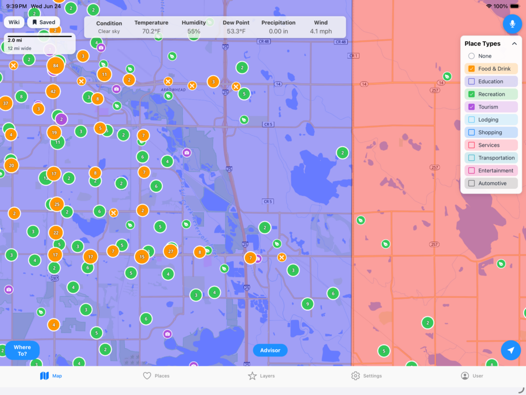
NEW FEATURE:
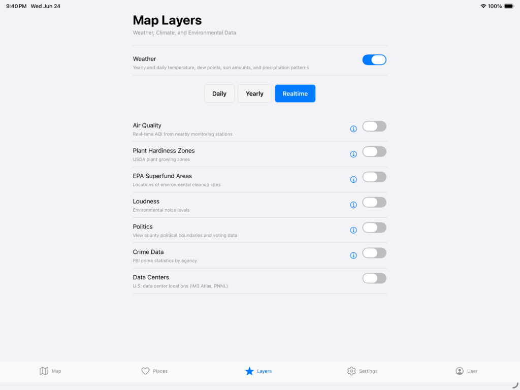
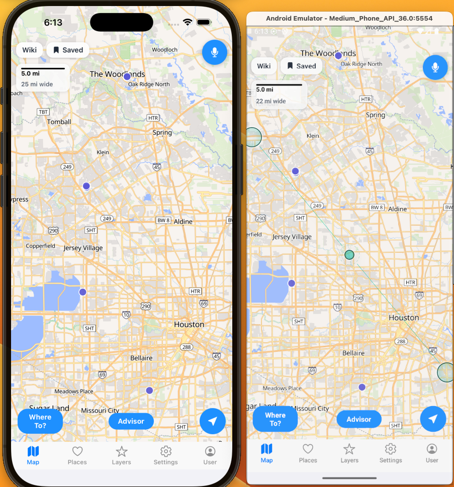
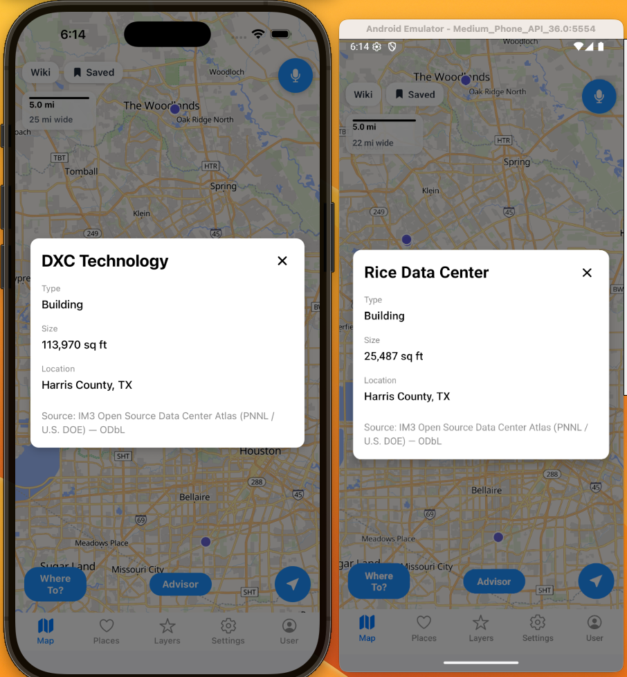
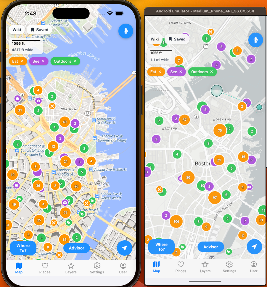
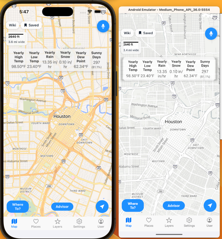
Now, you can see Datacenters within the United States. Currently, there are over 1,400 via IM3 Atlas and PNNL. Here are some side by side shots on iOS and Android for comparison.
Datacenters:
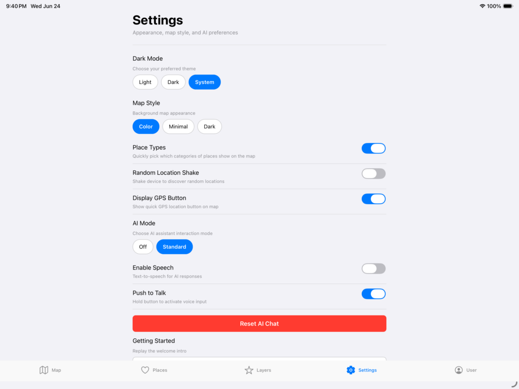
Also, as a reminder, here are some of the features you can now view for free.
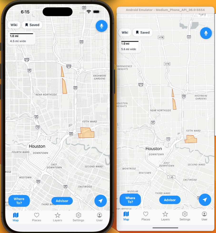
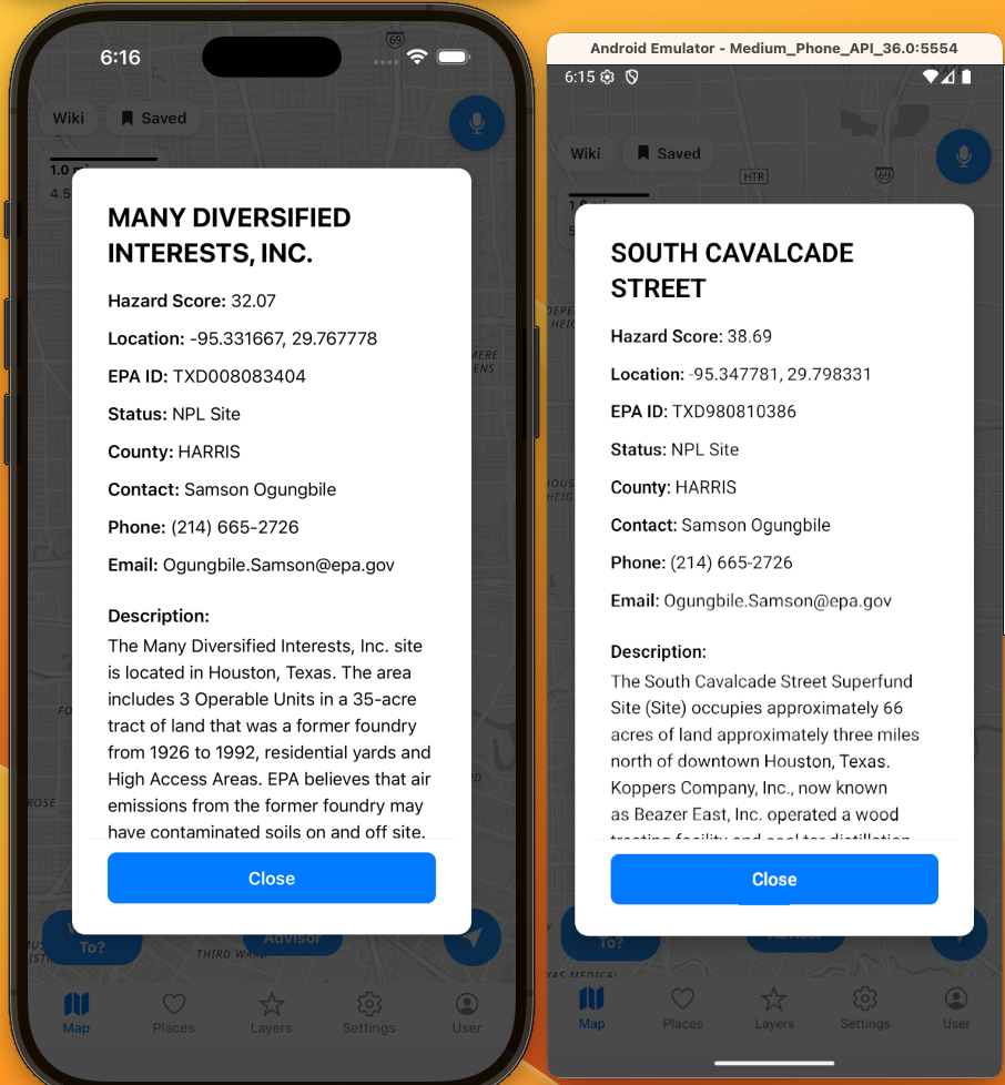
EPA Superfund areas:
I built in a few different map styles including color, minimal, and dark. Here is minimal with EPA Superfund areas turned on to make it easier to see some data when you are doing deeper analysis.
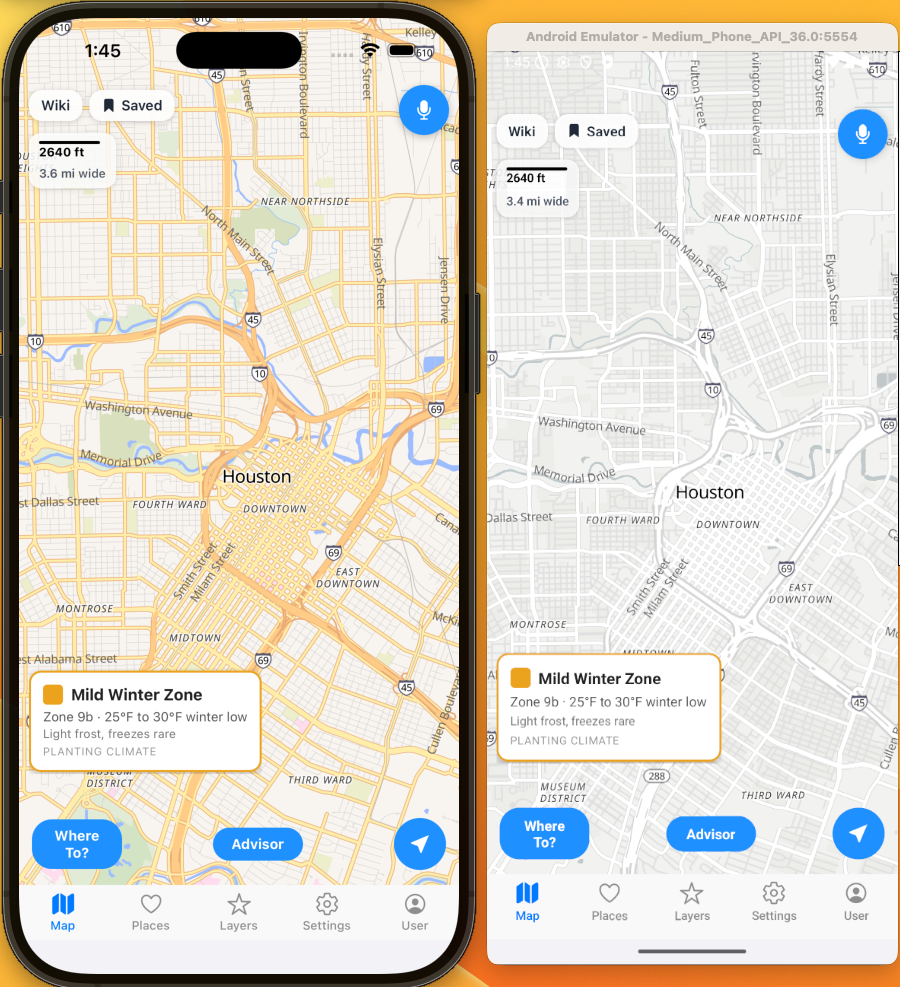
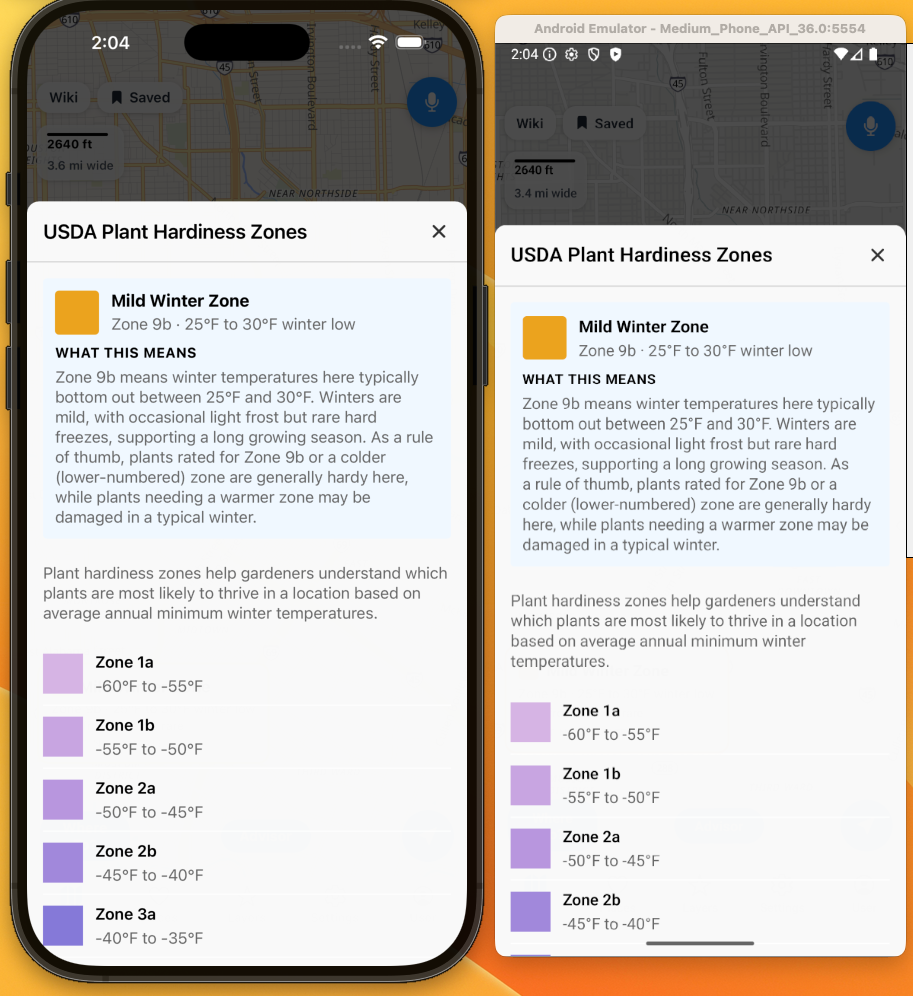
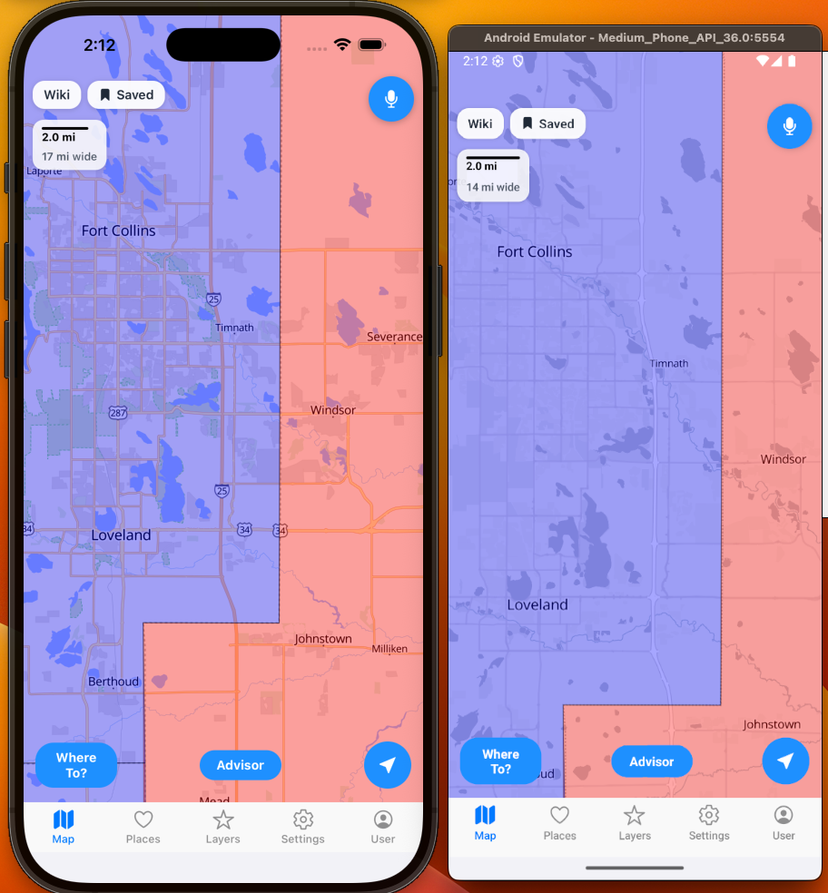
Plant Hardiness Zones:
Comparison of Plant Hardiness Zones with color and minimal color.
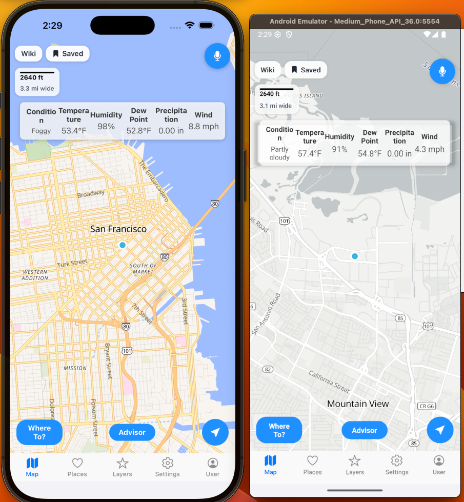
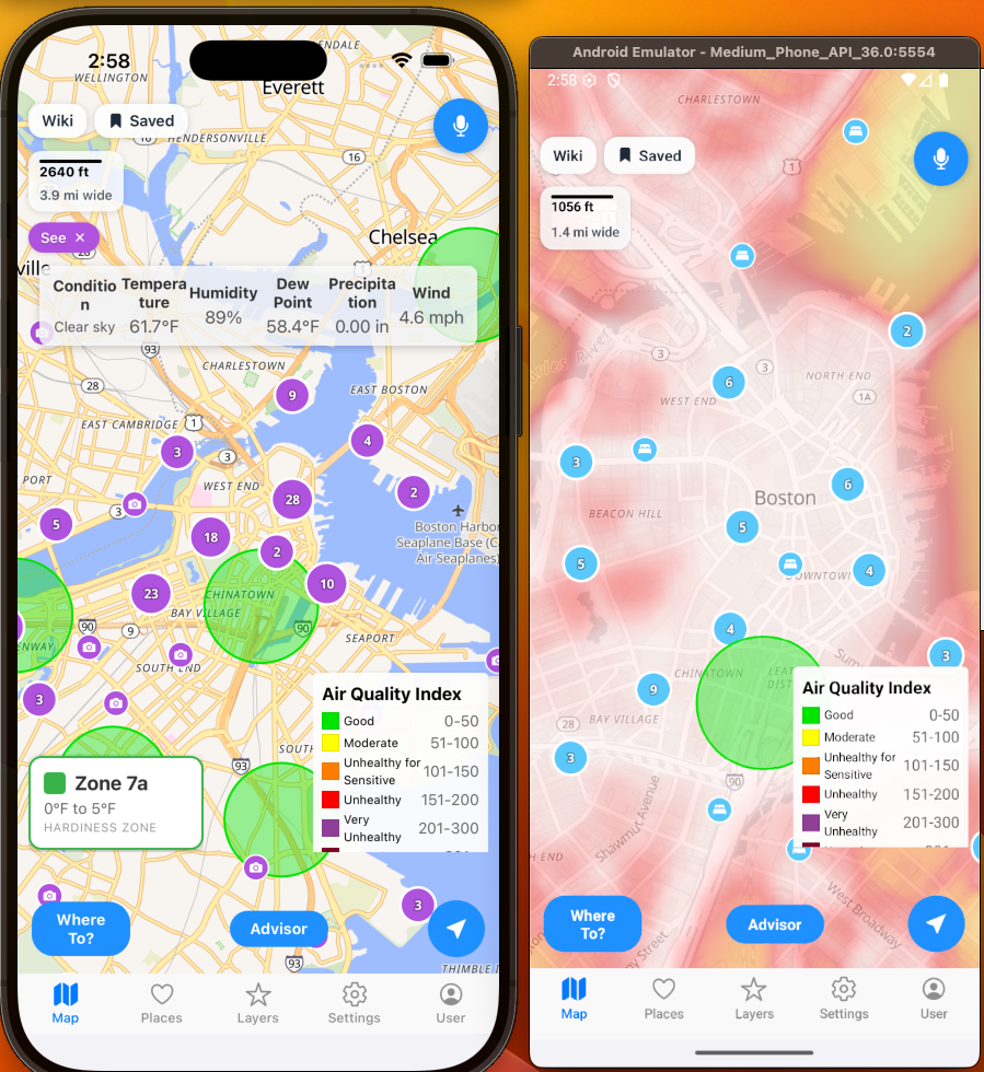
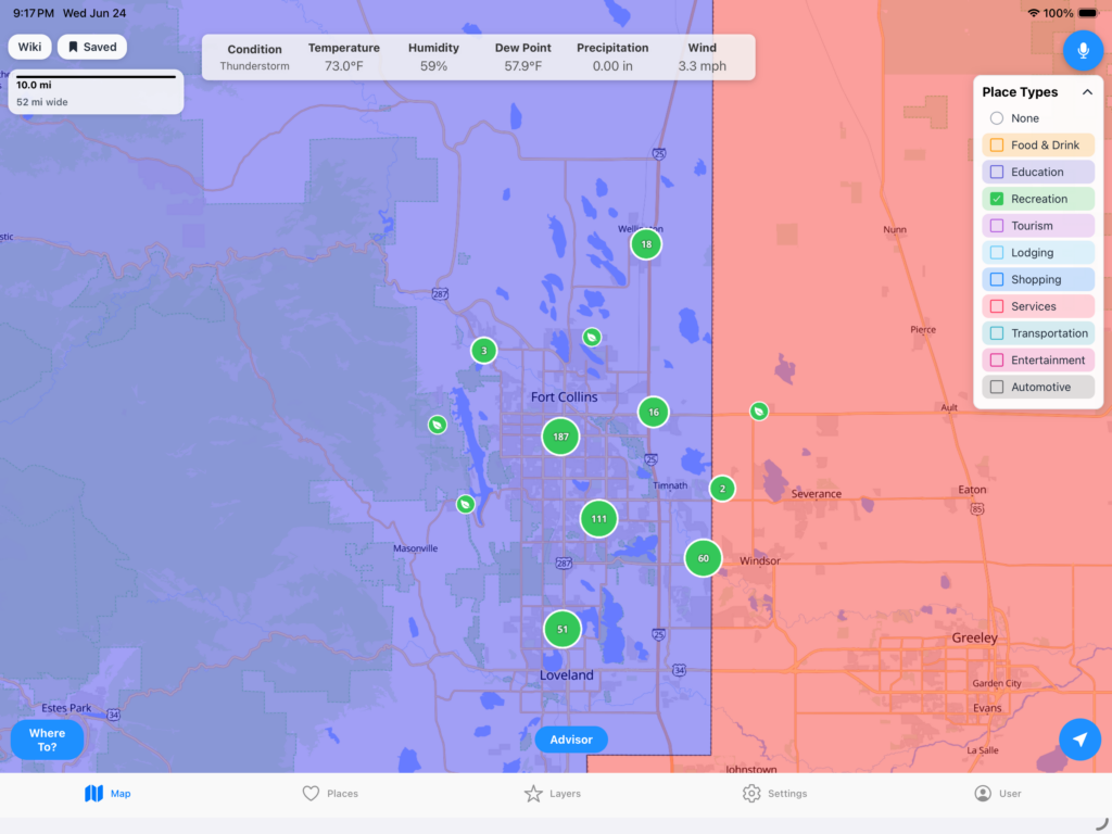
Realtime Weather:
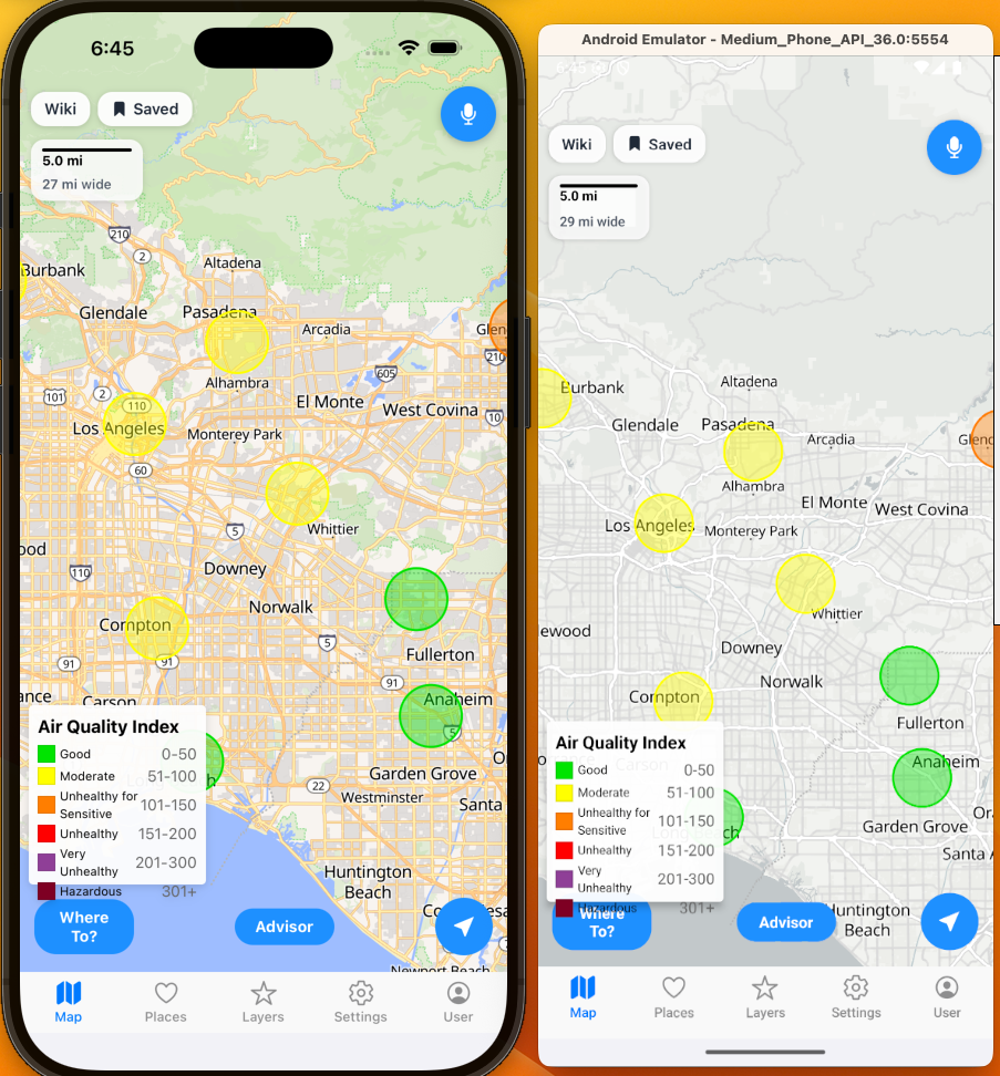
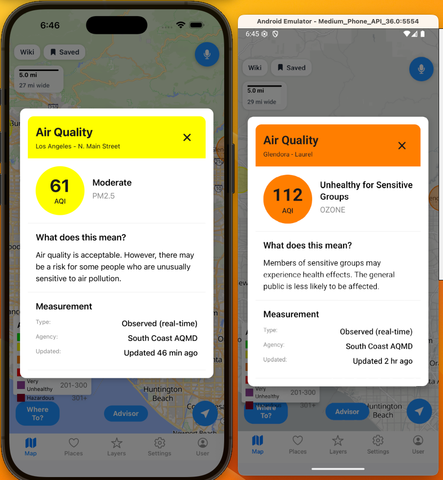
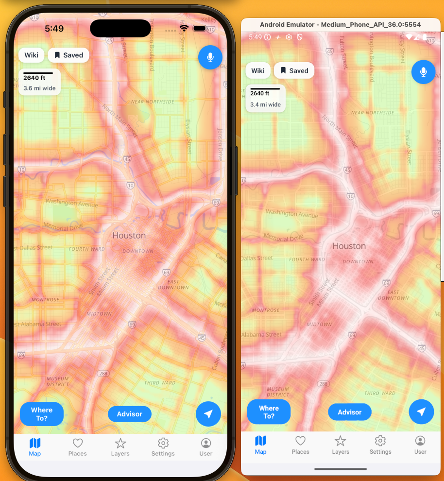
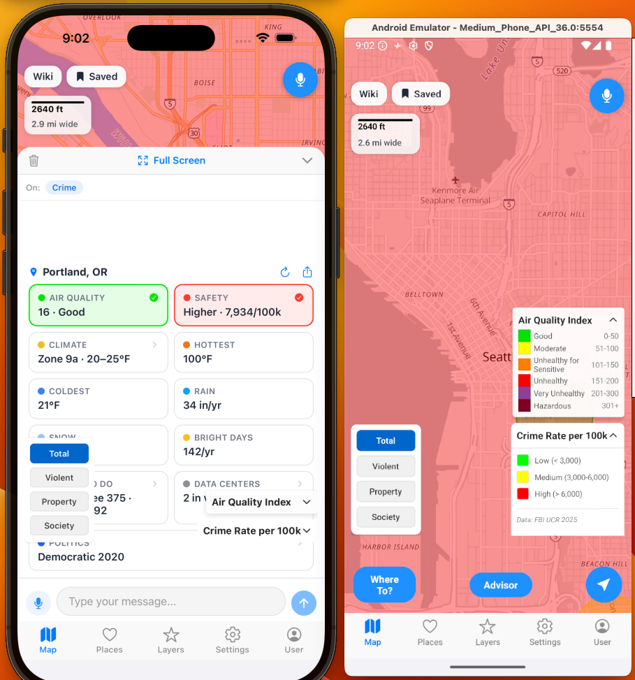
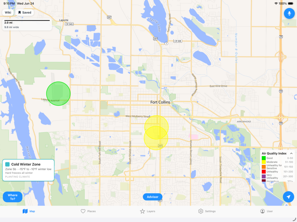
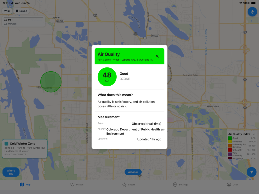
Air Quality:
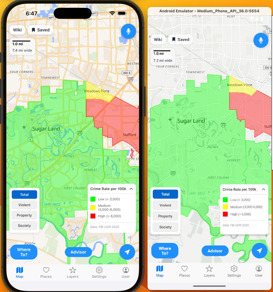
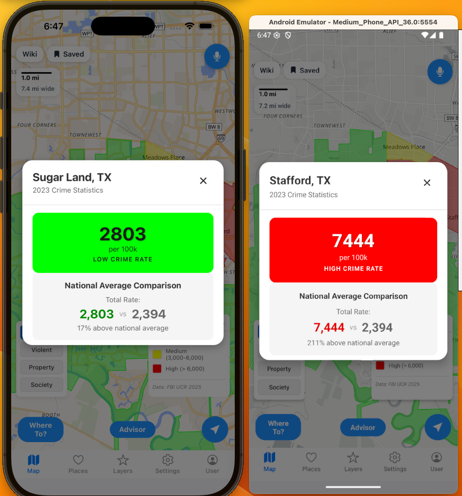
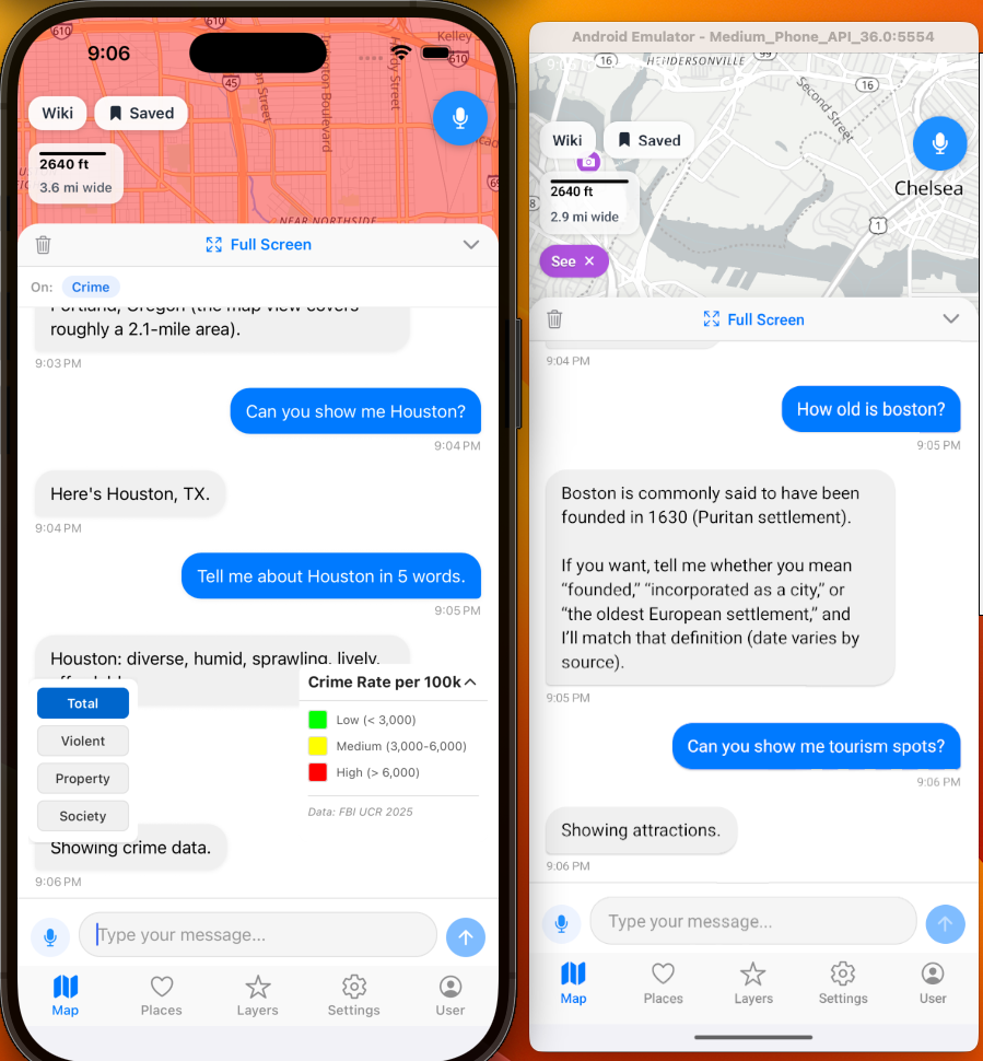
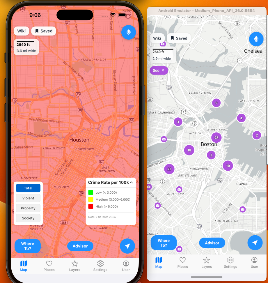
Total Crime:
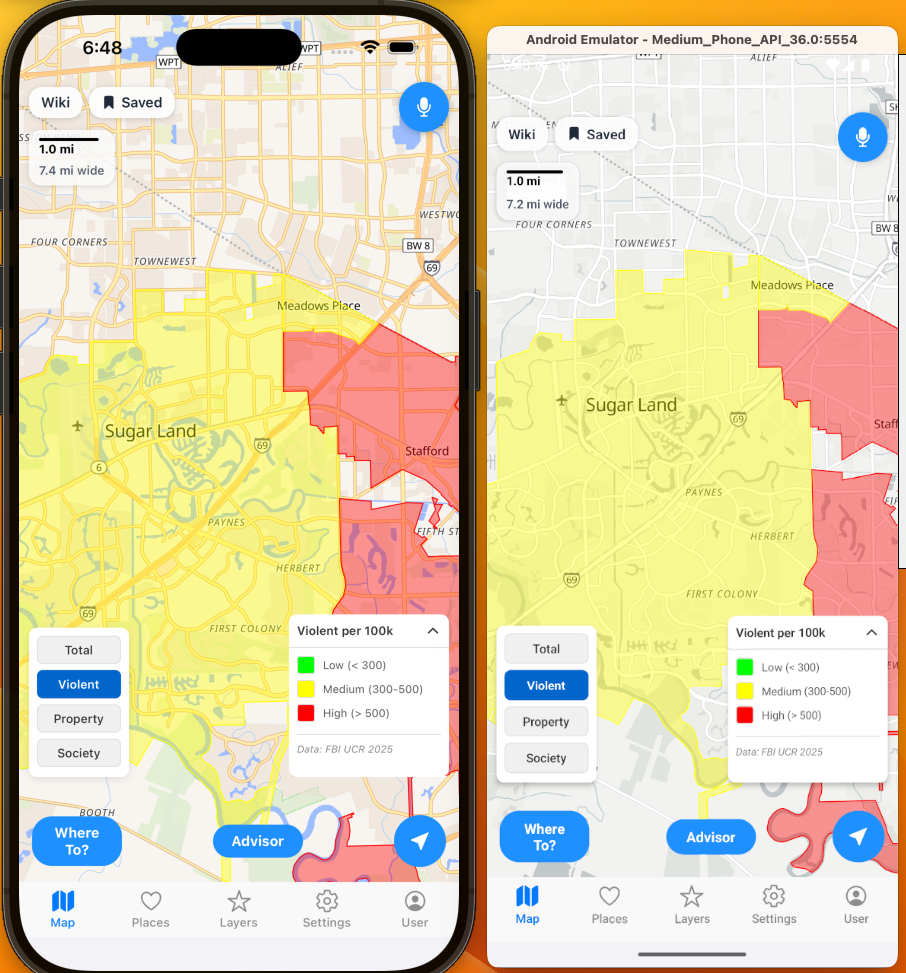
Violent Crime:
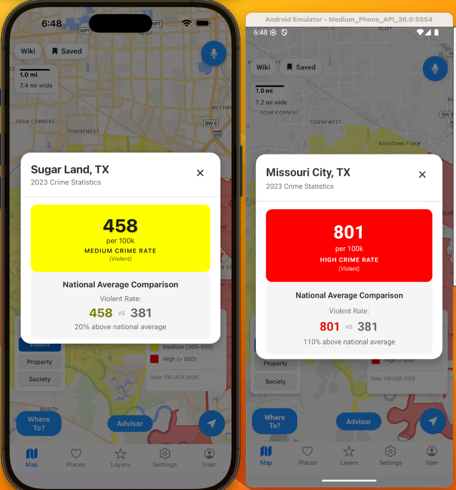
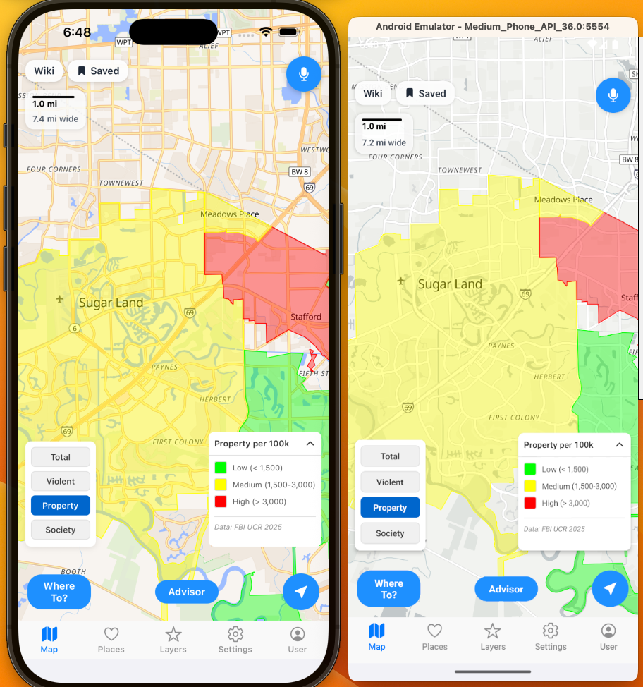
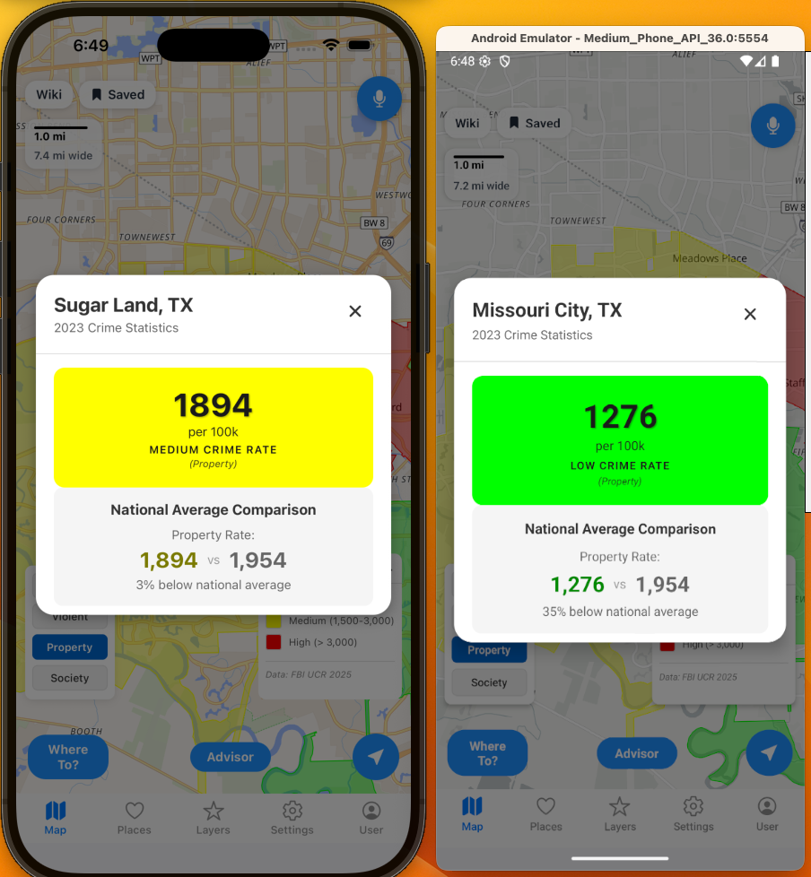
Property Crime:
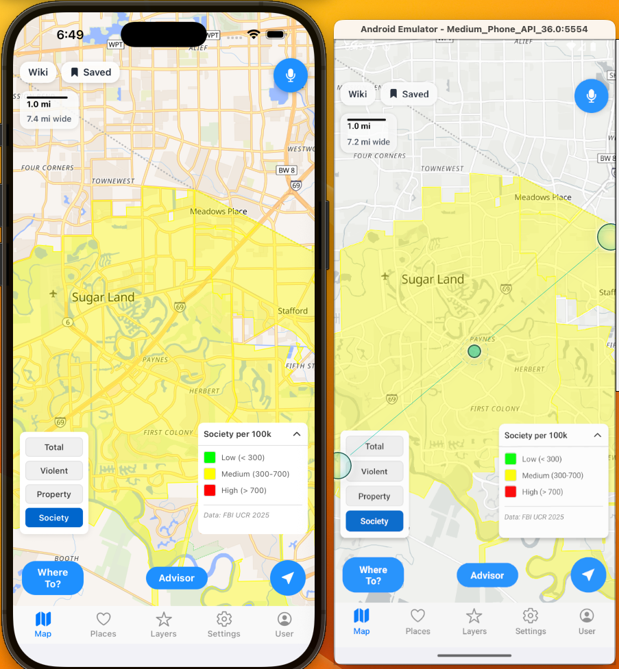
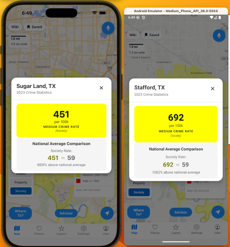
Societal Crime:
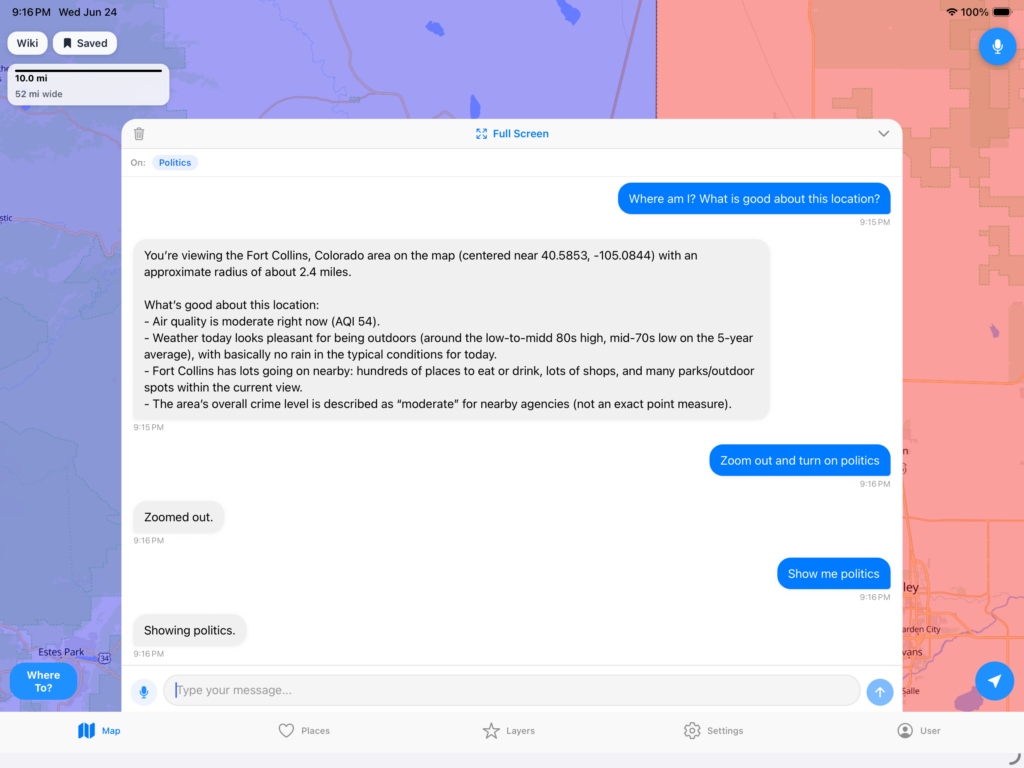
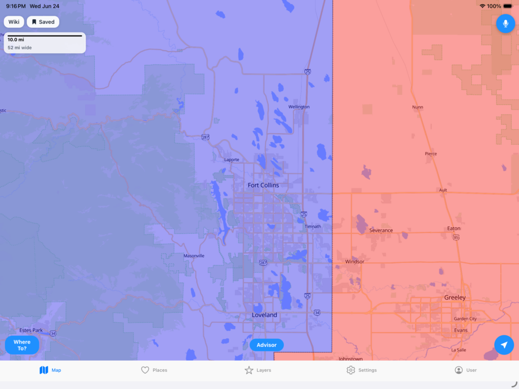
Politics:
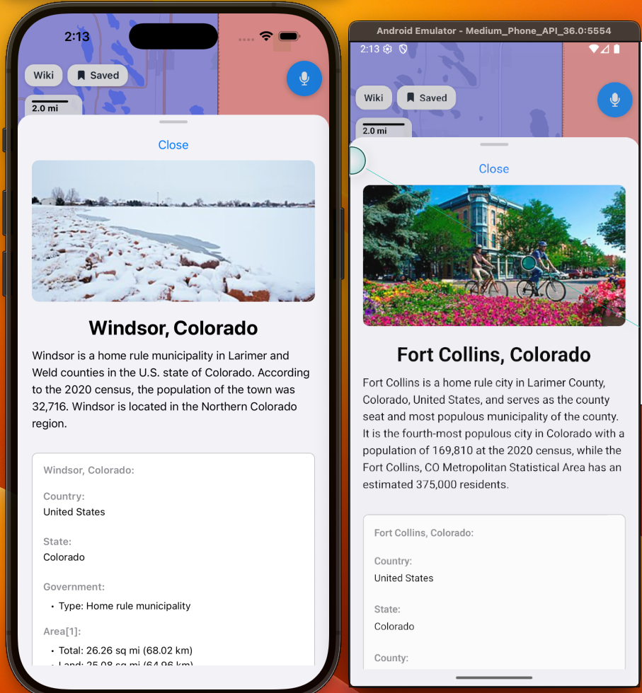
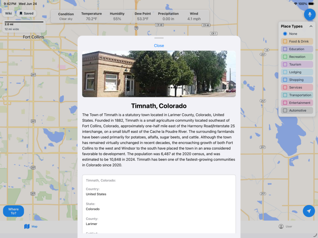
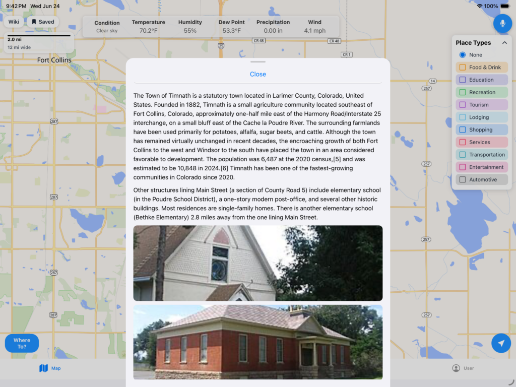
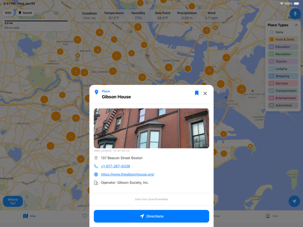
Wikipedia:
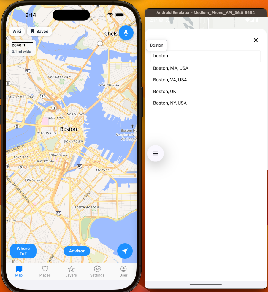
Autocomplete (For Locations):
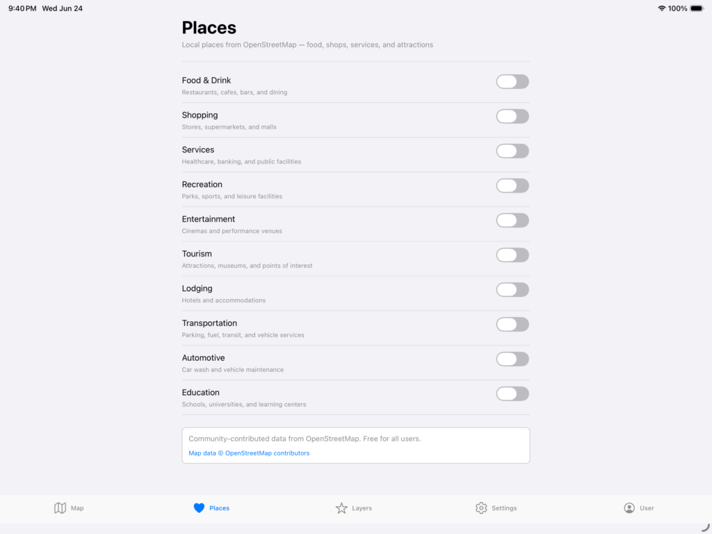
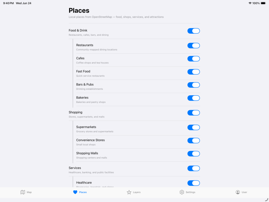
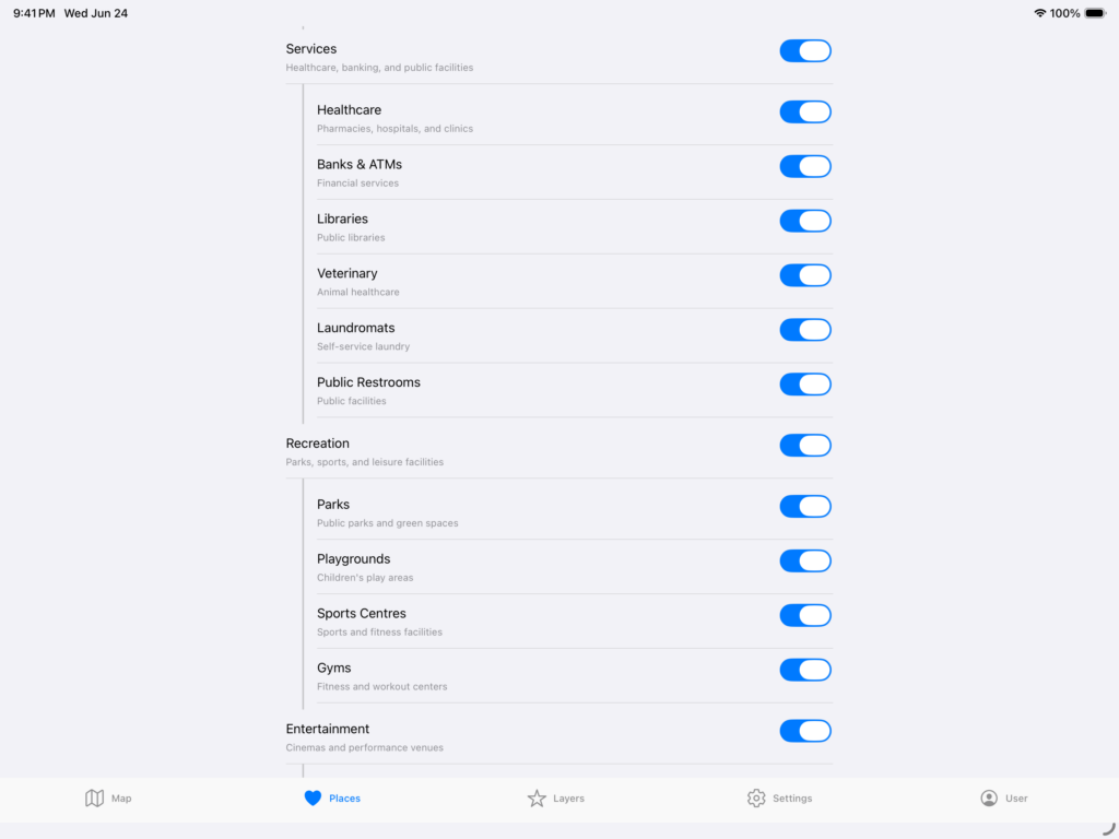
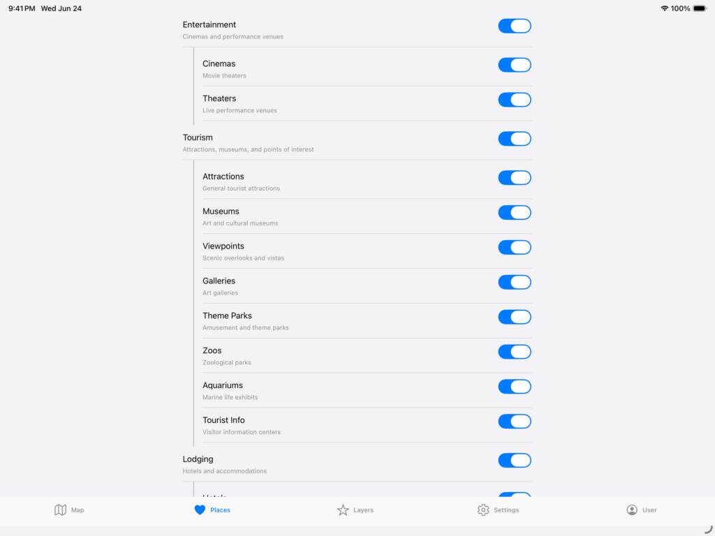
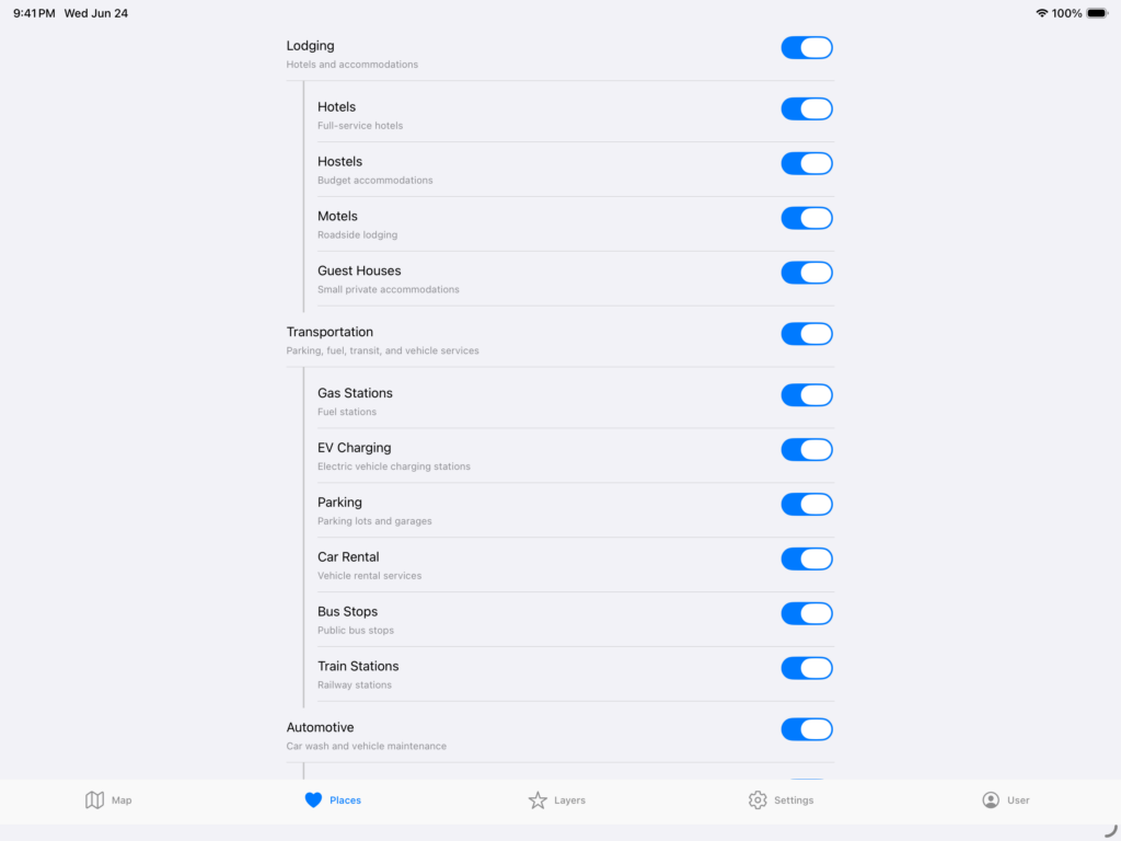
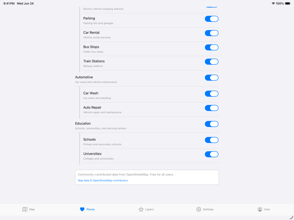
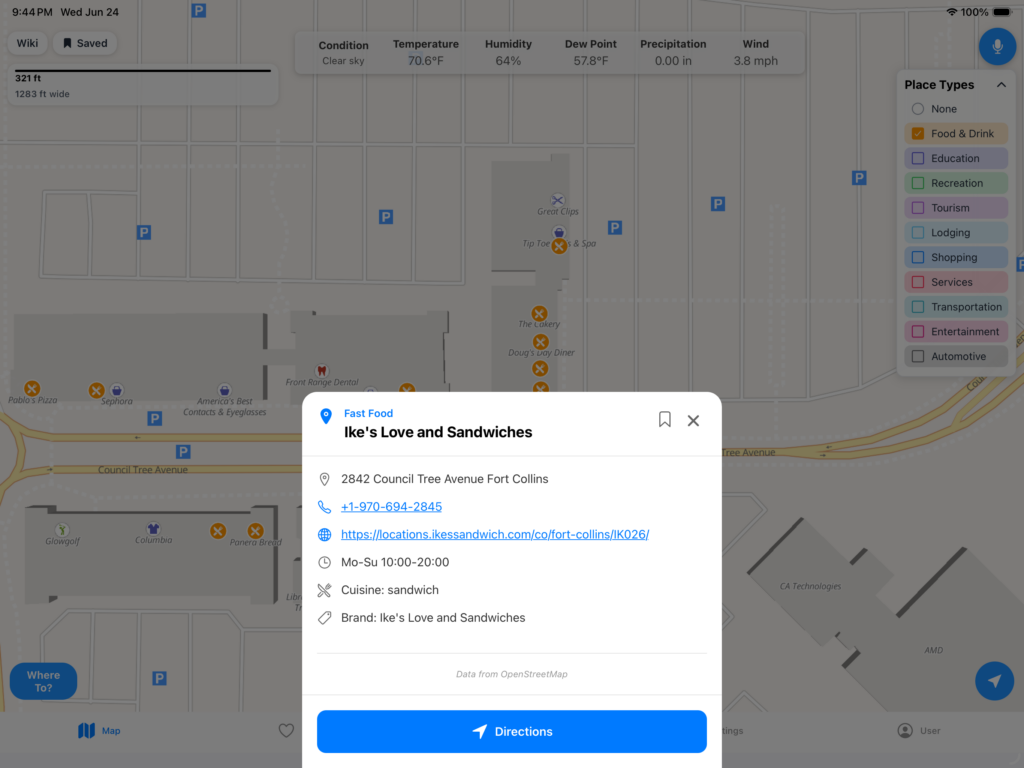
OpenStreetMap:
And of course, OSM, which is continually updated and open source and community driven. Here are some examples of what it can do.
Also, remember that you can combine layers and places together to get a better visual image of what is going on.
It is a vast amount of data sources. The remaining paid subscription additions are the following:
Yearly Average Weather:
Looking back at the past 365 days for total precipitation, sunny days, lowest low, highest high, etc.
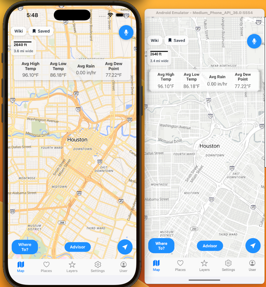
Daily Historical Weather:
Looking back the past 3 years and averaging the current day and location for the weather.
Noise Levels:
Looking at the noise levels. Think SPL meter for a location.
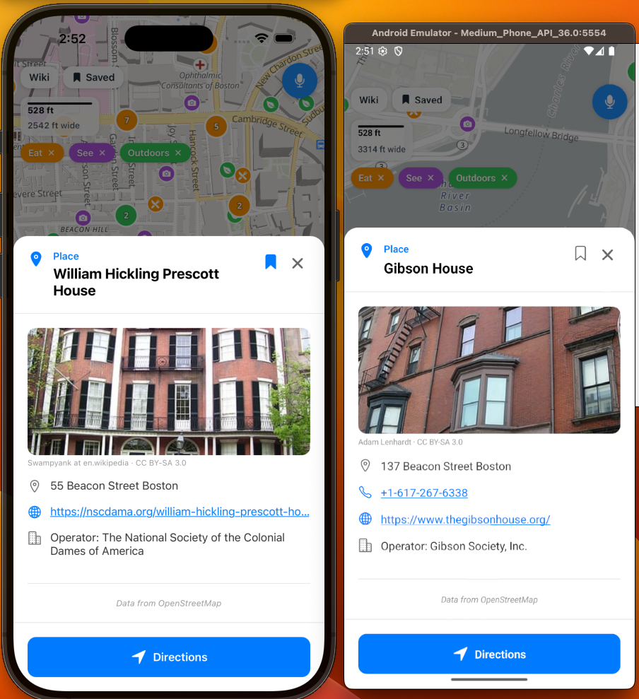
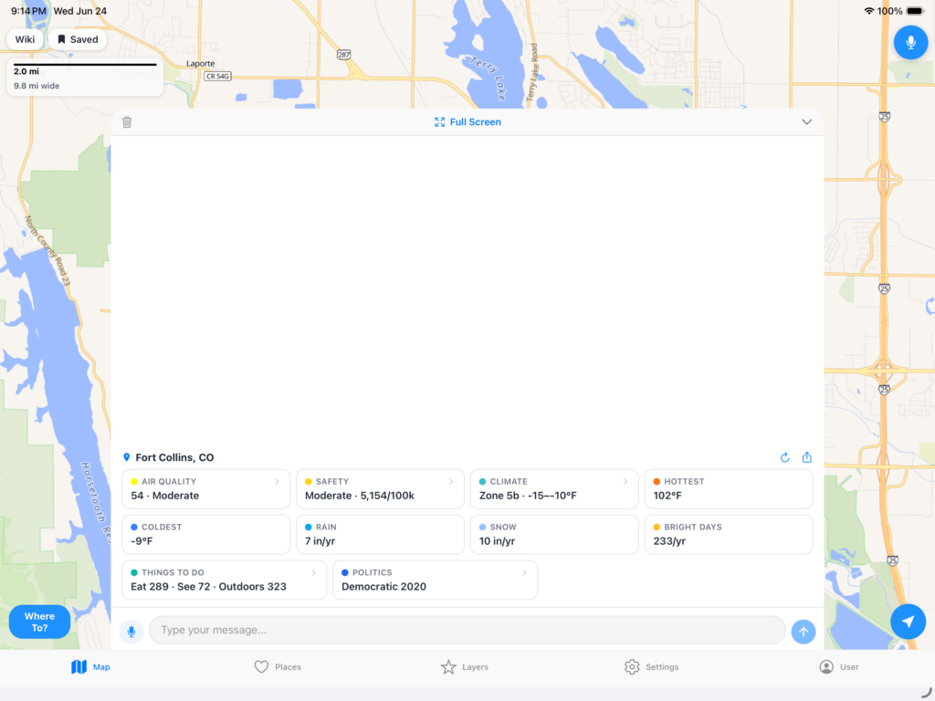
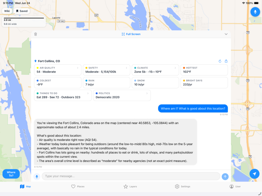
Area Briefing:
The biggest question I always got from people was, is [location] a good place? I would pull out a spreadsheet and give the rundown on a location. Here is an example from 4 years ago of a mockup in Tableau that later became this app.
Years later, all of that data and more infrastructure and front end development led to this single button that gives you that data at a glance.
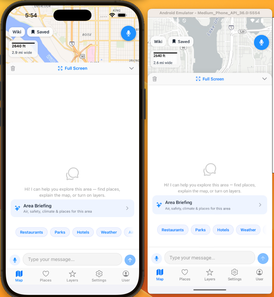
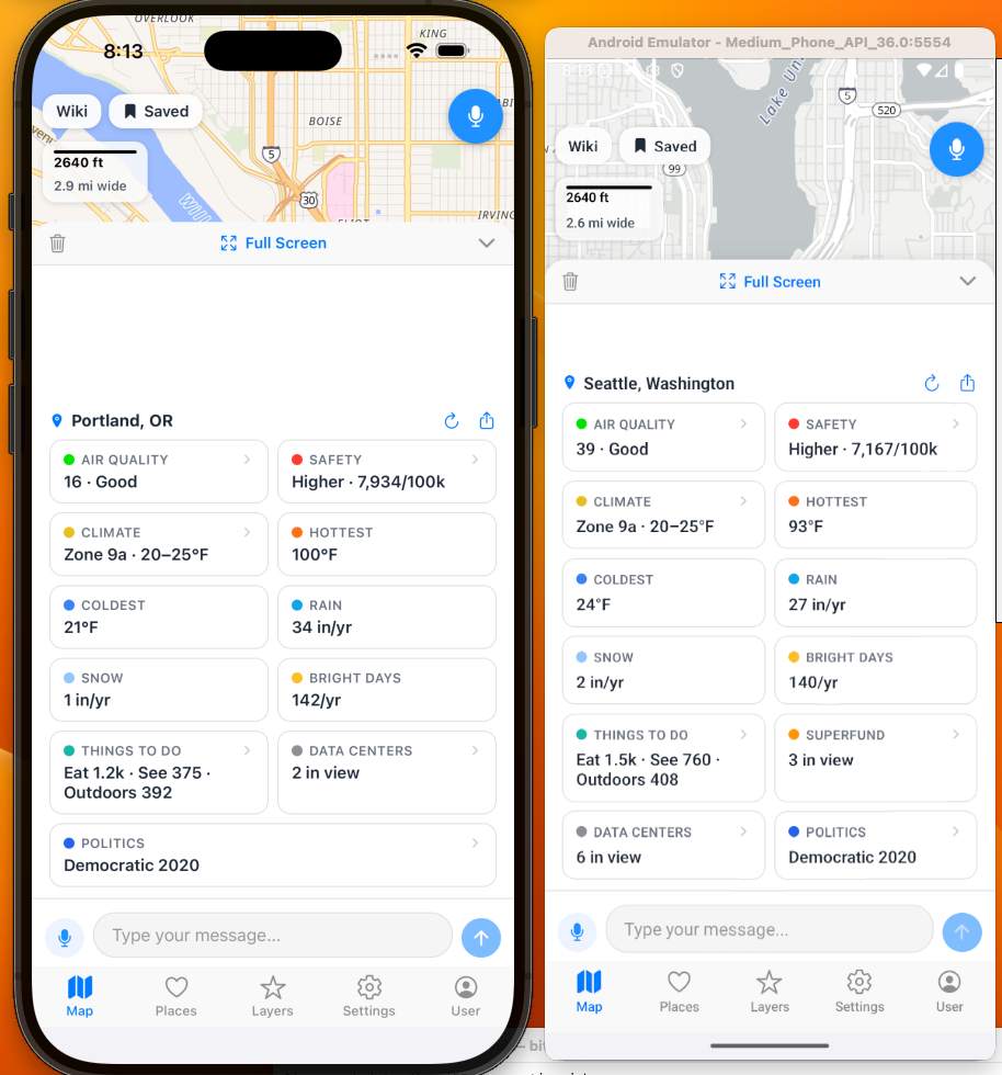
The Area Briefing is also a control panel that allows you to enable or disable layers too.
And AI:
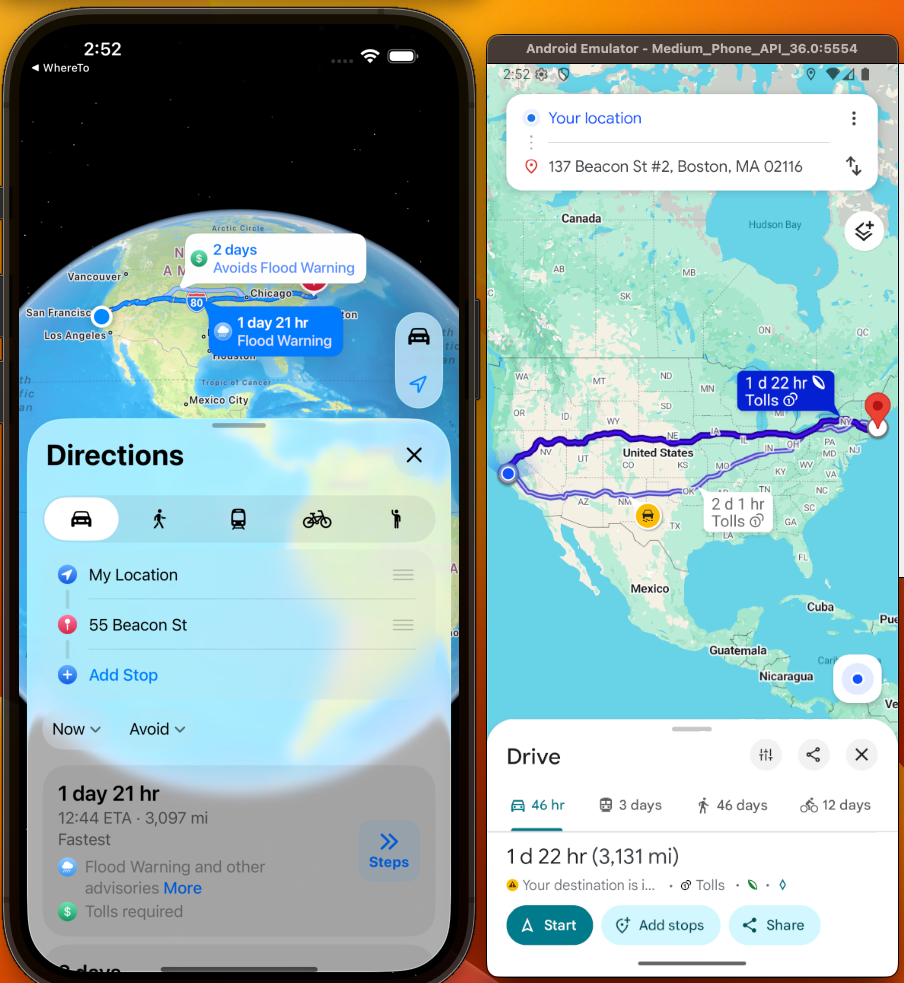
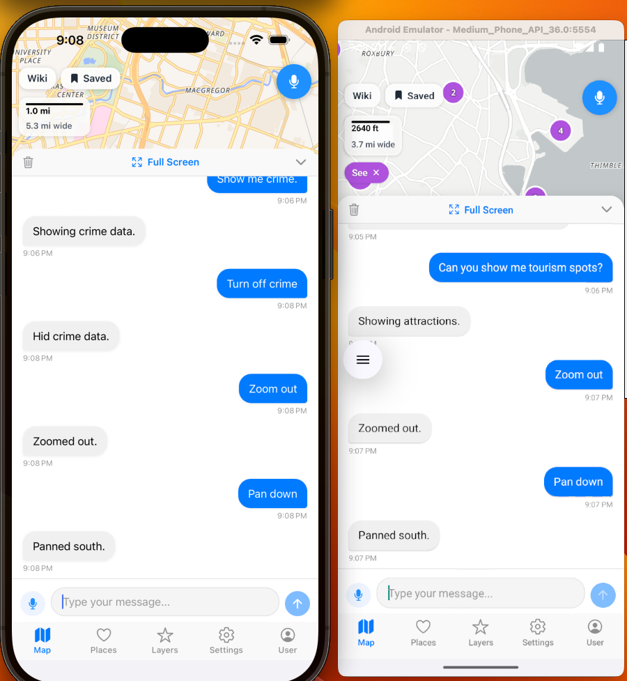
Chat with the AI and it will even do functions. Also, includes voice chat so you can talk and have it move the map, turn on toggles and filters, etc. Designed for easy of use and full interaction with a location.
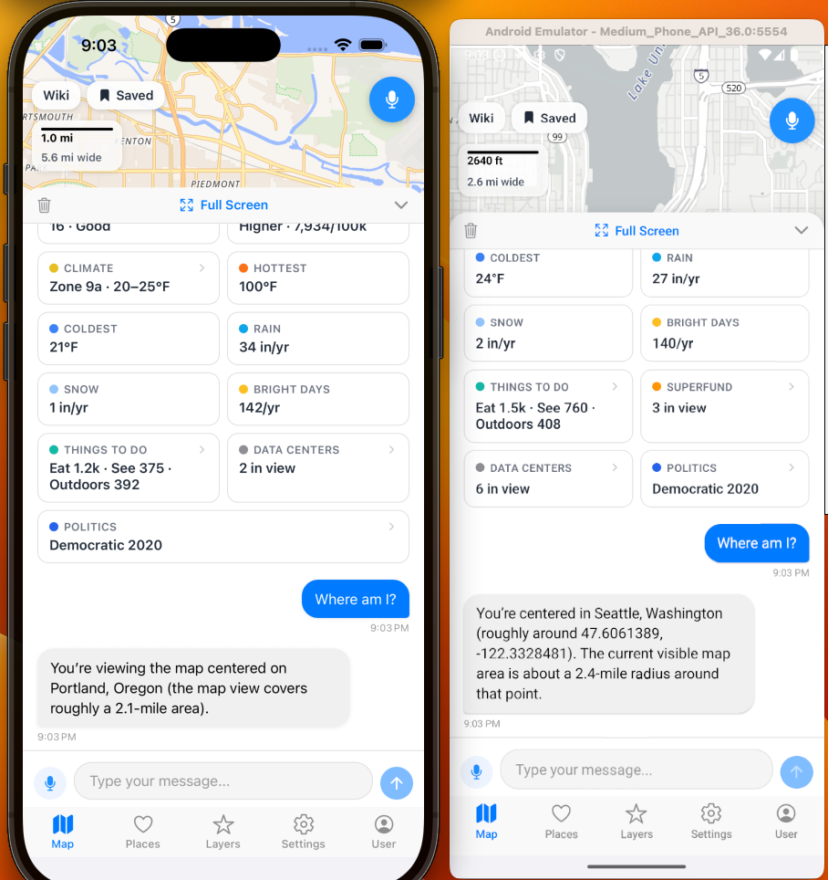
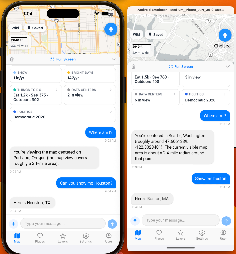
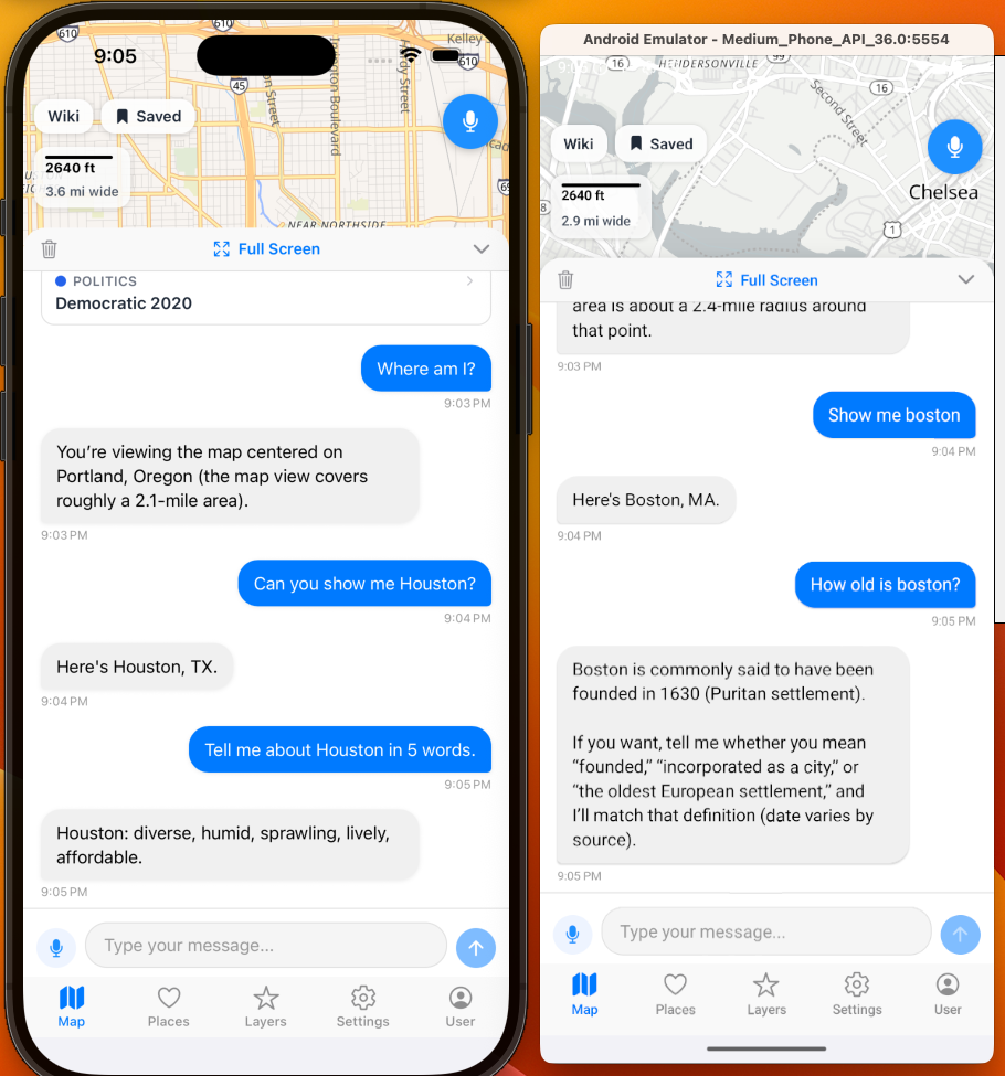
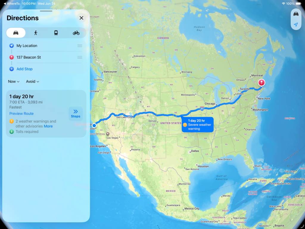
And of course you simply use the push to talk in the top right corner and not use the AI chat window at all if you desire or use both. Here is an example of speech to text built in that does not use an API call outside the app. Designed for accessibility includes the ability to turn on and off functions, zoom in and out, move the map around, jump to another location, and interactive chat sessions.
Works on Tablets:
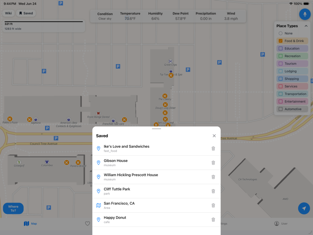
Go ahead and bookmark places you are interested in and come back to later.
Different Datasources and Options: