TL;DR: Simple idea. Know what is around you and make better decisions.
This application is a big one. This was my first real attempt to build my own production application. During the process, I had an insane amount of scope creep as new ideas and possibilities kept popping up and it delayed the release so much that FactCheck came out before it. However, WhereTo was my first attempt to solve a real world problem, namely, how do you know where to go and what is around you when you do?
Why build WhereTo?
What is it?
How does it work?
Where do I get it?
Demo – iOS/Android
Closing Thoughts
Bonus: Unfinished Article “Using Tableau to find ideal Californians Cities”
Why build WhereTo?
I love this question because as Simon Sinek has taught, it all starts with why. Why put in the effort to do something? What keeps you going when you are tired, exhausted, sick, or just plan demotivated?
For me, the why started many years ago during Covid. Remember those years? Back then, there was a reshuffling occurring around the United States as people were moving around due to all time low interest rates combined with a new workplace option to work from home. It was a catalyst for change as millions of people started to take advantage.
Additionally, you had many large corporations moving their headquarters to different states. Indeed, many companies moved away from California to Texas such as Tesla, SpaceX, X, HPE, Oracle, CRBE, and Charles Schwab between 2020 and 2024. This change in workplace forced many to choose whether to move with the company or find another job closer to home.
So why build it? I like to help people solve big problems and as those around me talked about their dreams of moving, but not knowing where to go, it tickled the INTJ portion of my brain. Family, friends, coworkers… they all seemed to share dreams of moving during these unprecedented times and were given the opportunity with low interest rates and remote work, but without the knowledge or tools to make a better decision. What if they made the wrong choice where gritty reality intersected with their wistful dreams?
So I started to listen and ask questions, compile those metrics into spreadsheets, then listen and ask more questions.
Back in late 2020 I started creating spreadsheets for ideal places to live based on different metrics. I made sheets for many states, but here is California as my starting baseline.
However, trying to explain data or show how numbers compare does not work for many people; it is too abstract and not concrete enough. Most people like pictures and images. As a result by February 2022 I pivoted and went back to my Tableau experience and made a Tableau visualization to show ideal places to live in California based on a limited subset of data including politics, dew point, temperature, elevation, precipitation, etc. It was a proof of concept to see how it translated the information in a more succinct way than raw numbers and data.
It’s ironic because I even wrote an article on this topic back then, but never published it. If interested, you can scroll to the end of this article for the Bonus: Unfinished Article to read about it from almost 4 years ago.
By 2022 rates started changing, but I kept updating and as a side project started taking programming classes on full stack development such as React Native, JavaScript, HTML, etc. However, something bigger happened that same 2022… OpenAI released ChatGPT 3. This started to show me what LLMs could do to accelerate development timelines and improve a person’s productivity. I spent the next couple of years deep diving into AI as you can see by the different articles on ideasquantified.com.
Fast forward to 2024 and there is a lot of uncertainty about the future, especially around politics. People started asking me again about where to move. Luckily, I had been maintaining my spreadsheets waiting for interest rates to drop again and had a variety of options and information to offer people to help them find their dream home in their ideal location.
Home… that phrase reminds me of something Casey Neistat said. He was not born in in New York, but moved there when he was young. Then, moved to California to be with family and then back to New York again. He said this when he had his realization, [New York] “It’s the place where we became ourselves. It’s not our home by birth, it’s our home by choice.” Spoiler alert, if you keep watching after the quote is a killer song with some amazing editing.
So I got to work. In August 2024, I built my first prototype. On the 17th, it was a crude web only application that was powered by Google Maps. On the 18th, it added in Zillow and showed thumbnails. You could click two locations dynamically and it would calculate time and distance. On the 19th, I added in Jobs appearing that would then move the map. The idea technically worked, but it was not the prettiest, nor was it the most usable.
It needed to be beautiful like Tableau and mobile accessible. It had to include a lot of the same options I had used in my spreadsheets regarding politics, climate, crime, etc. Additionally, once I did finish the prototype I would then need to build it to scale, another incredibly hard challenge. The first build hit the Apple AppStore in private testing on October 30th, 2024.
Speaking of scale, I am reminded of a quote that Elon Musk brought regarding production vs prototypes. Building a prototype is relatively easy when you consider the complexities and challenges of trying to scale that prototype out. Over the next 18 months, I would come to realize how true that statement was.
All in, I would spend approximately 180 hours in 2024 and 119 hours in 2025 building. That includes 379 Git commits for the front end and 90 for the back end plus the associated database work and webpage marketing developing the idea into a production ready application. Some days I felt like I was jamming with bio-digital jazz and some days I was Hugh Jackman in Swordfish, but others were a little bit of a slog when you are under stress and sleep deprived, rubbed raw from real world responsibilities. After all, I was building this idea on the side after work hours, on weekends, and during vacation time. That leads back to the original question of Why from Simon Sinek. Why push yourself? Why keep going when you are tired? Why Mr. Anderson?
Self admission time. I can be incredibly stubborn sometimes. My high school class ring was symbolic of that. There was a lot of symbolism on it, but there were two words on it that embodied who I was then and who I am today… Creativity. Determination. I imbue those elements in everything I interact with.
For me, I really wanted to prove that this idea was possible, could help people, and I guess in time it became like a real life video game in the same sense that I was unlocking levels with new features. When challenges hit, I was trying to beat them with no save code like an old video game. I was a gamer from the time I was little, visiting Arcades and playing old Nintendo games like Bionic Commando, Kid Icarus, 1943, and Ghost ‘n Goblins. Few save codes existed back then and you had to just keep trying again and again and again, sometimes from the very beginning. That meant you kept pushing yourself, failing, and trying again until you learned and won.
What is it?
WhereTo is a map application that gives location intelligence. It lets you know and see a variety of data such as what is in the air around you, the dirt below you, the buildings near you, etc.
Sensitive to air pollution? We got you covered. Wonder if you are near a pollution location? We have that too. Grow plants and wonder about the growing region? No problem. Sensitive hearing? We have you. Worried about politics or crime? We can show that too. Need an EV Charger? Yup. Need a place to stay? No problem. The information that is available is extremely extensive thanks to all of the integrations in place.
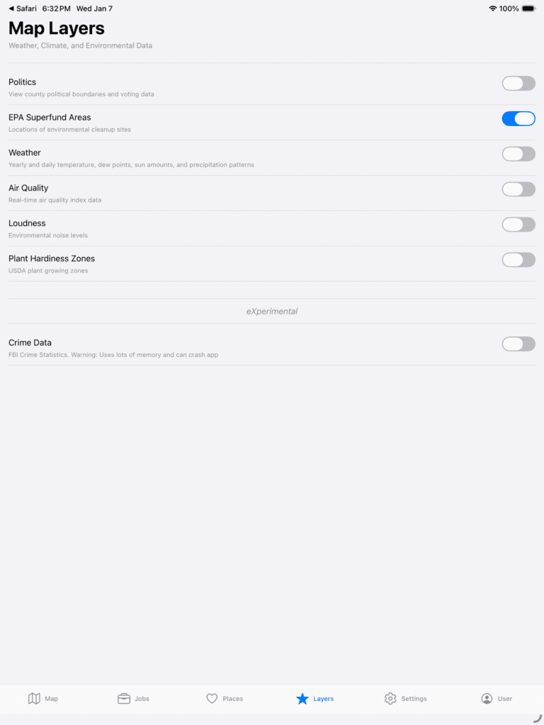
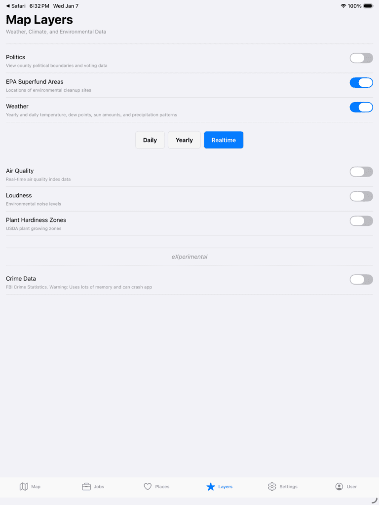
It is designed to run on multiple operating systems (iPhones, iPads, Android phones and tablets) and to give users access to more information visually in an easier way to digest. It has a framework that combines the following features. Here is a list of services that are integrated.
| Services |
| Wikipedia |
| OpenWeather |
| VisualCrossing |
| Open-Meteo |
| SchoolDigger |
| OpenAI Chat |
| OpenAI TTS |
| GeoDB Cities Ultra |
| OpenStreetMap |
| Google Places |
| Google Autocomplete |
| Google Geocoding |
| Google Geolocation |
| Google Nearby Search |
| Google Place Details Basic |
| Google Place Photos |
| Google Compute Routes |
| Jobs Search |
| HowLoud |
| EPA Superfund |
| Political Map |
| Crime Data |
This means you can dynamically compare and overlay multiple pieces of information to get better analysis and a quick visual representation of things.
How does it work?
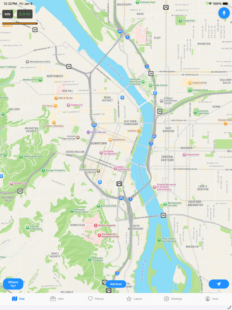
I wanted to embed some gaming and fun aspects. One example is that when you first start the application it loads a random city within the United States. Rather than use a list of names, I chose the strategy to get a random latitude and longitude and then check for the closest city nearby. This allows the user to have a fun and interesting way to learn more about the United States and some cities they would normally never be exposed to.
This is an example on an iPad.
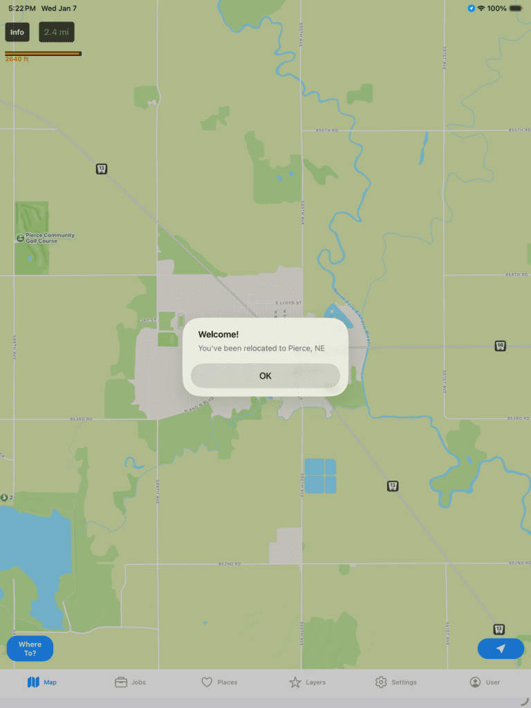
If you click Ok to see the area better.
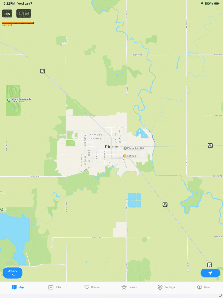
At the top left, you can click Info. It will query wikipedia and tell you more about the location you are at based on the coordinates in the center of the screen.
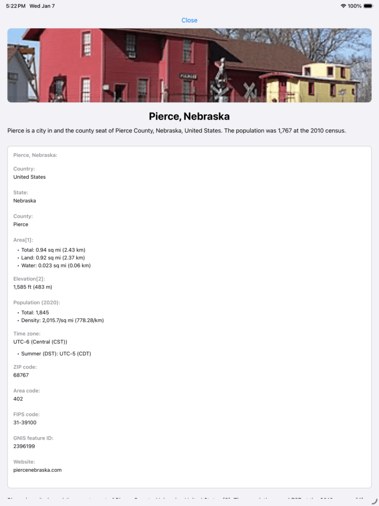
You can scroll down and read more about it.
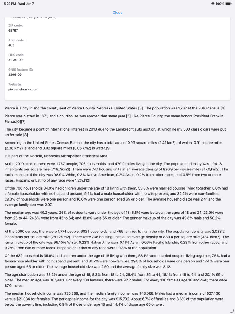
Click Close at the top to see the Map again.

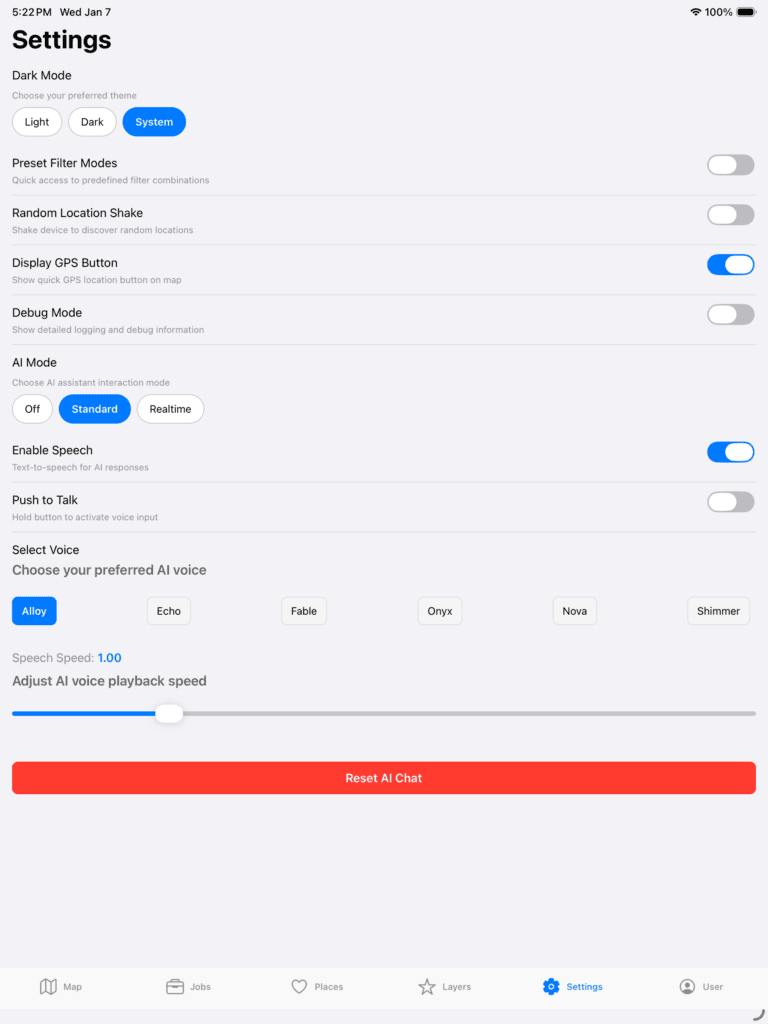
Let’s try doing something else. Let’s turn on some features. Click Settings and turn on Standard AI Mode and choose your voice and playback speed. I wanted to give users more flexibility so I put those in since sometimes people can be a bit impatient at some people that talk too slow and are in more of a hurry.
Also, as a point, no AI chat information is stored on IdeasQuantified servers. Privacy is a big pillar of its foundation so information is only stored locally on your own device. Just click Reset AI Chat to remove it from your device when you are ready.
If you click the Map button at the bottom left you will see a new option near the bottom called Advisor.
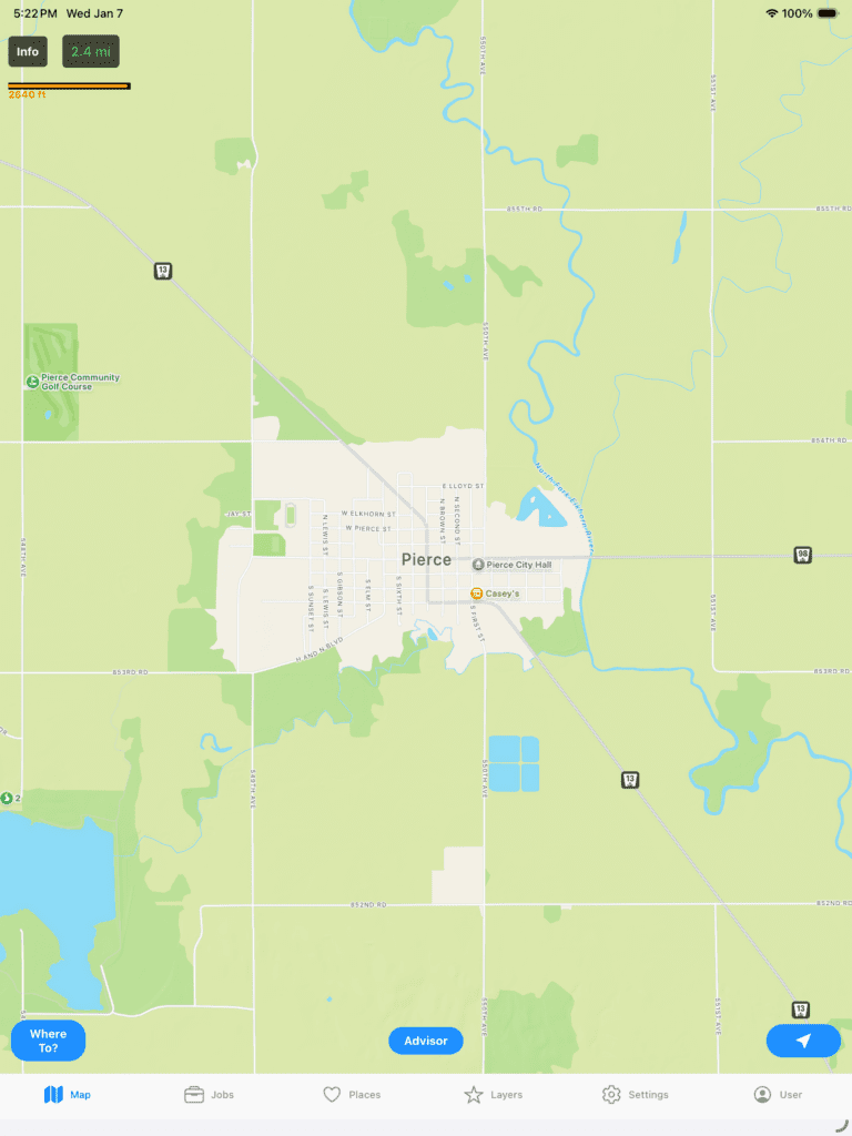
If you click it, it will let you interact with the application. Note, the AI is aware of the coordinates of where you are looking in order to help turn on features and functions. Let me demonstrate.
A few different options are available from TTS (Text to Speech) to STT (Speech to Text). There is also an option for Push to Talk where it will hide the chat window completely and give a more fluid and seamless experience.
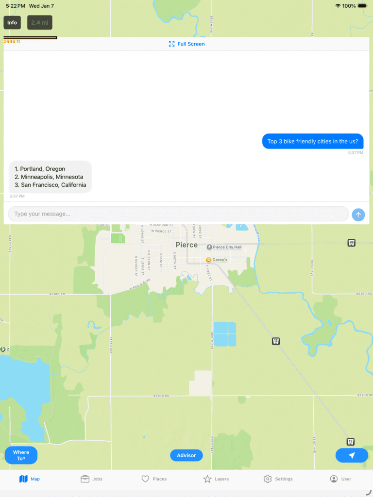
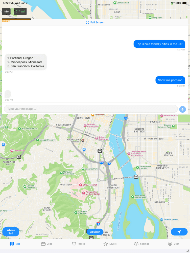
I tried to give it an iMessage feel so that the user is more immersed in the chat. Here I acted like a user that knows a little about what they want and wants to know where good bike cities are. Now, let’s see what else we can do.
If you ask it to show you Portland, it will move the map to those coordinates.
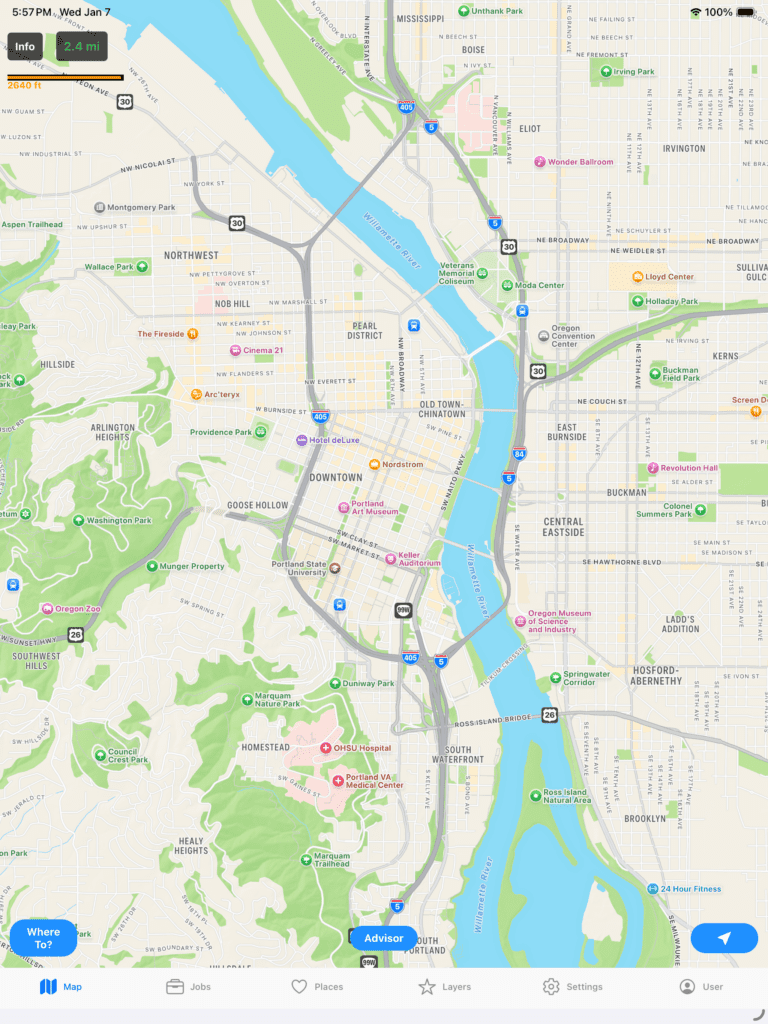
Click the Advisor button to hide the chat window. Note, if you enable Push to Talk you do not need the Advisor Chat window at all since you are interacting in realtime using your voice. It will display a microphone icon in the top right of the screen that you push to interact with the AI. Here is an example of the difference.
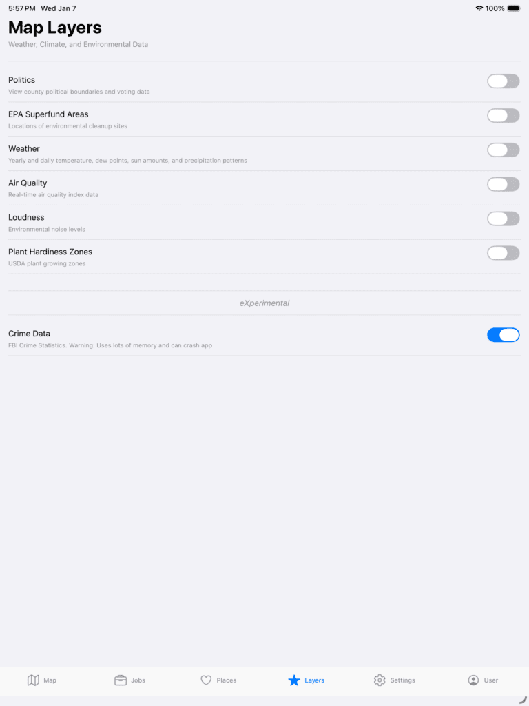
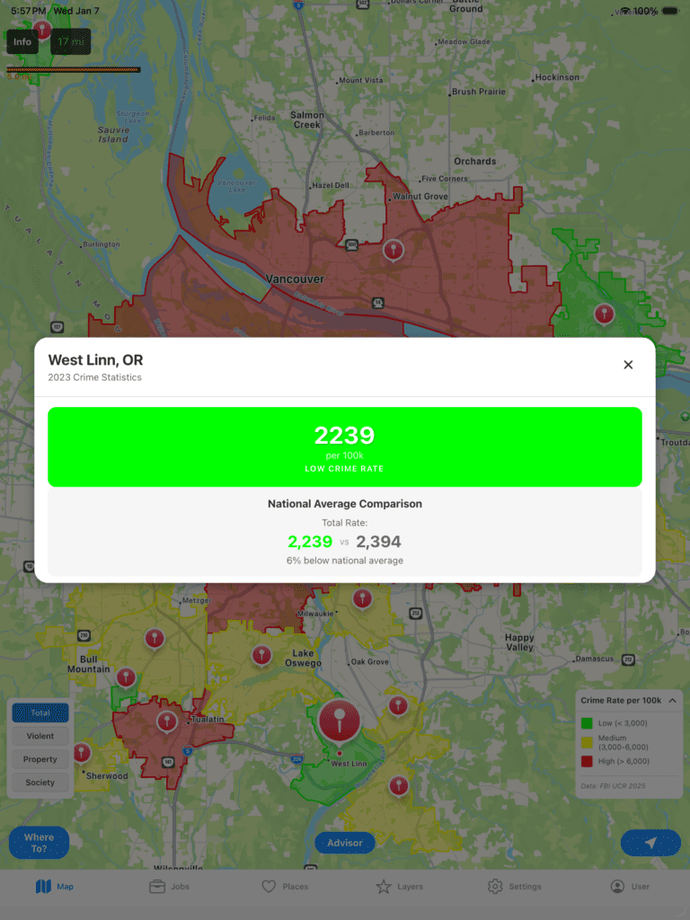
Now, let’s try some other stuff. You can turn on different layers. Let’s see how crime is.
Go back out and you can see how crime is for the area you are in. Note, crime and political data are displayed based on county and city data. Those boundaries are determined via coordinates and plotted on the map.
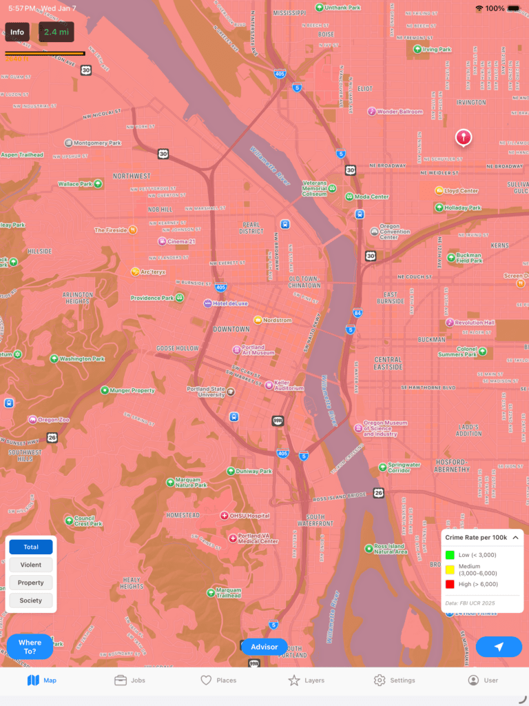
It looks like a bleak battlezone, but let’s put it into perspective. Let’s zoom out for a moment to get a bigger picture.
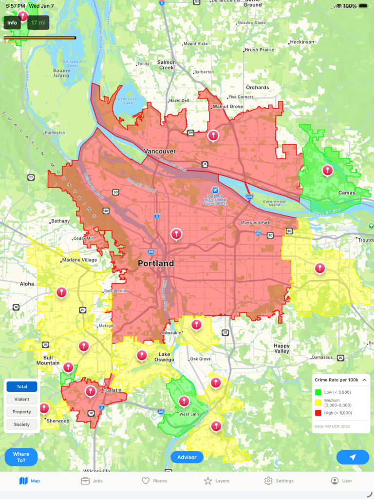
Now we can see the crime is not all of Portland, but only parts of it. Also, the indicators to the left allow you to choose which crime you are checking whether it be Violent, Property, Society, or an aggregate of all. If you click any of those areas you can drill deeper to get more data. Let’s check out West Linn, the area south of Portland.
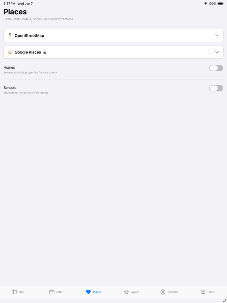
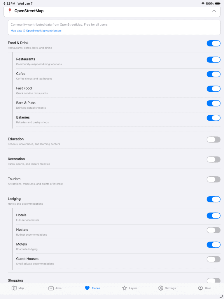
Cool, but what if you want to stay at a hotel nearby and want to make sure you are not in a “bad part of town”? We can do that. You have two options, Google or OpenStreetMap. Google is expensive and for paid tiers while OpenStreetMap is a community based effort and free for all. Let’s compare both to see what you can do. Go to Places at the bottom to choose.
Note, Crime data is currently an eXperimental feature as I am working on building out the dataset so be mindful that it could crash.
Next, expand OpenStreetMap and turn on Lodging.
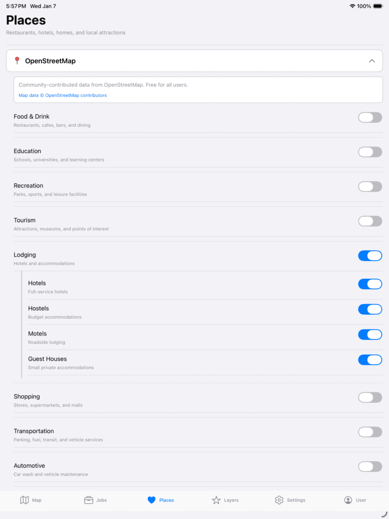
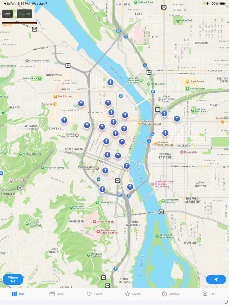
Now, when we go back to the Map we can see the following.
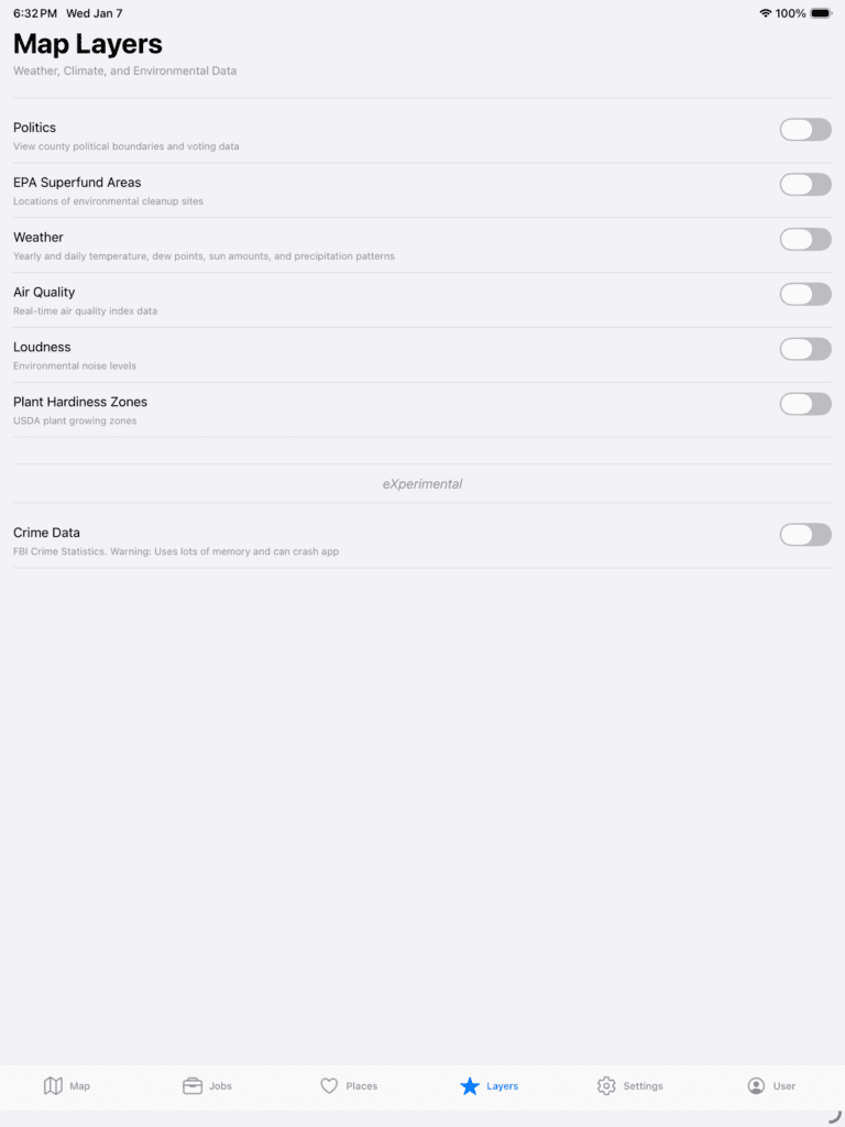
Let’s see what happens if we turn on EPA Superfund Areas. To do that, go to Layers and turn on EPA Superfund Areas.
Now, click back on the Map.
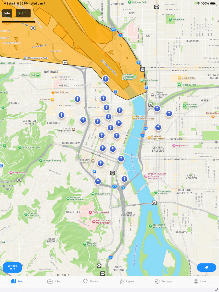
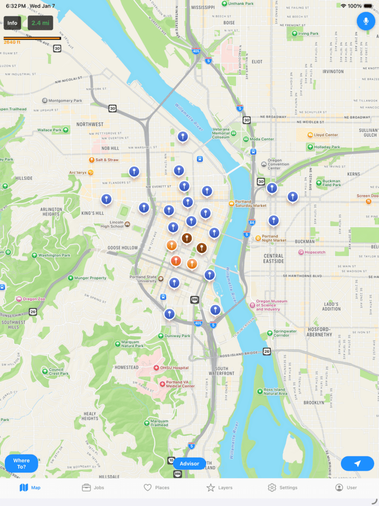
Notice some of those Lodgings are near an EPA Superfund Area. Click the Orange area and it will let you dive deeper into that zone.
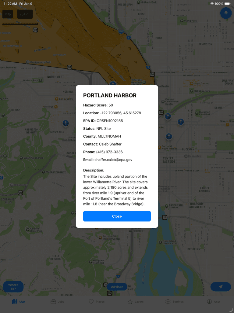
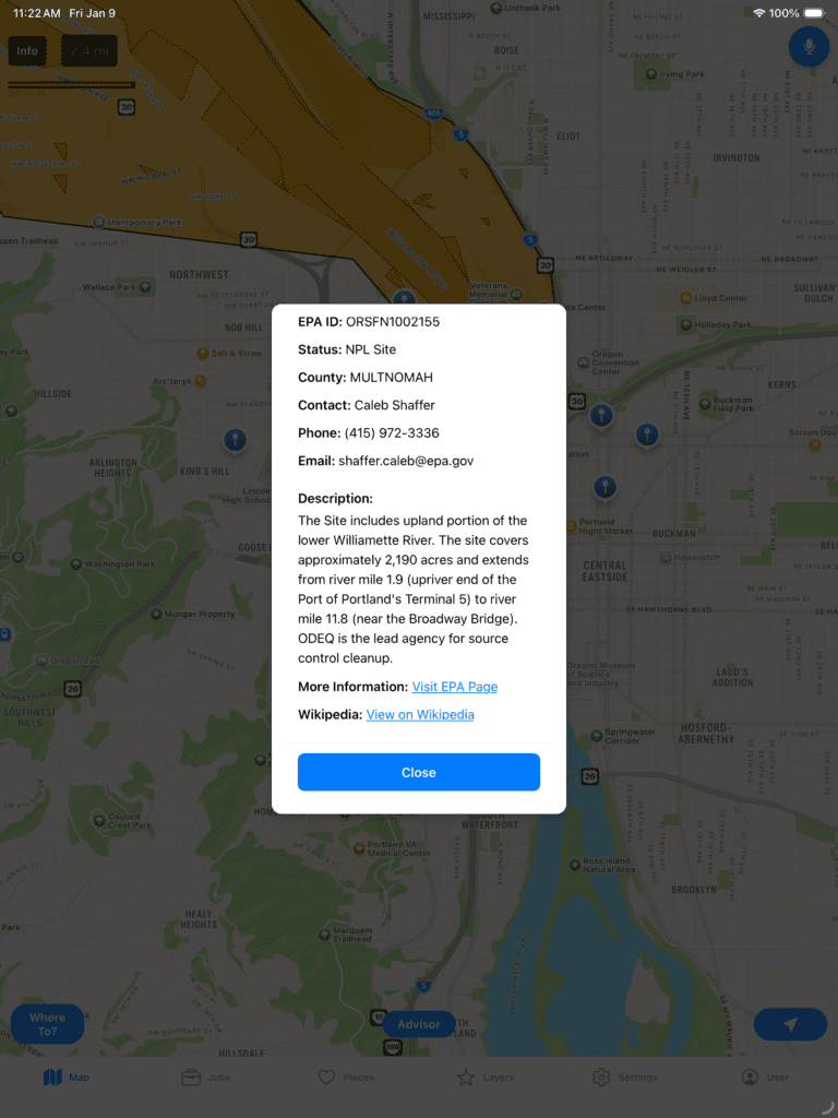
It will give you more information about the Superfund site such as a status and a score from 0 to 99. If you scroll down, you can read more about it including links to the EPA specific site for the cleanup as well as Wikipedia. Also, note Superfund sites do get cleaned up over time. You will know when you are looking at a cleaned up location when status says “Deleted.”
What about weather for the current location? You can see Realtime weather, Daily historical average, and a Yearly snapshot for the last 365 days. Just go to Layers, and choose the one you want and switch around as desired. It will automatically update the data as you browse around on the map.
Here we can see the current realtime forecast for Portland. Note, Dew Point is included because that is a better measure of Dry vs Humid temperatures compared to Relative Humidity.
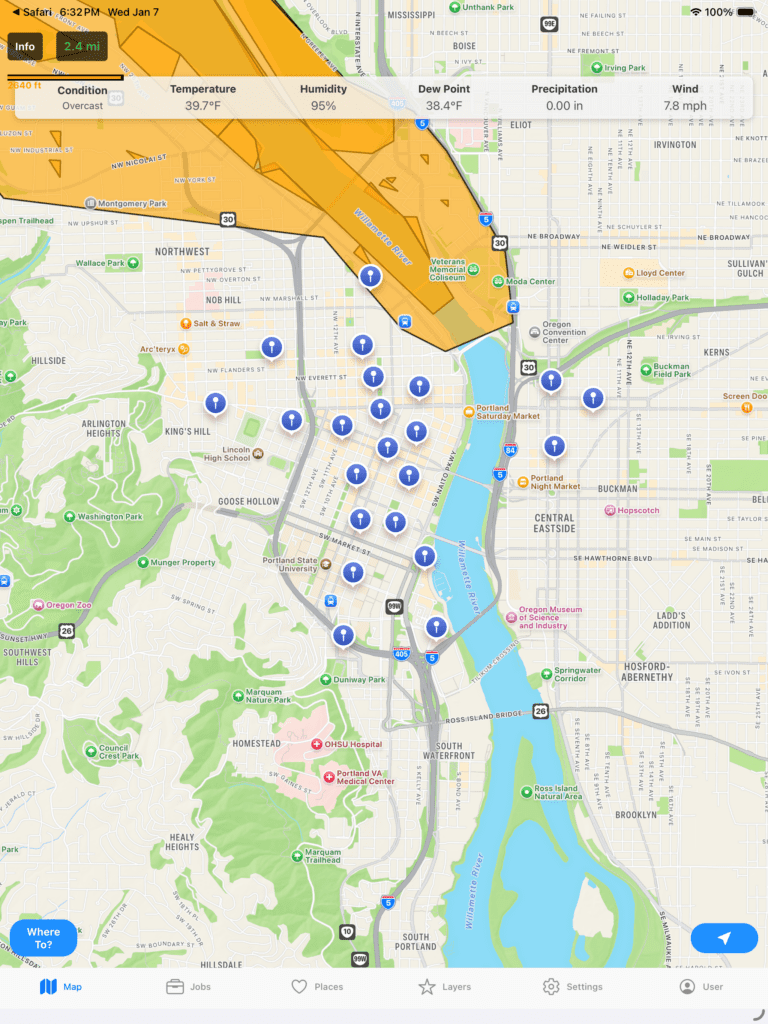
You can click one of the markers to see more information.
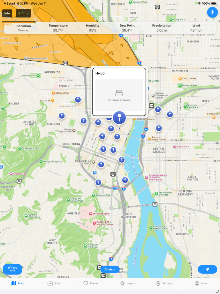
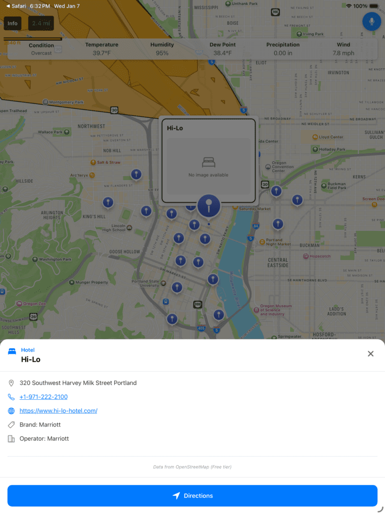
What is Hi-Lo? Click it again and it will expand and show you more information. Additionally, an In App Browser has been built in so that the experience is faster and does not require the user to switch around from app to app.
You can also choose other Markers to differentiate. Let’s turn off some Hostels and Guest Houses in Lodging and Turn on Food & Drink.
Also, go ahead and turn off Weather and EPA Superfund Areas so we can see the Markers clearer.
Now, go back to the Map. Different colors represent different categories. Blue is for Lodging. Browns, Oranges, and Yellows are for Food & Drink.
If you click one you can see there is a Morton’s Steakhouse.
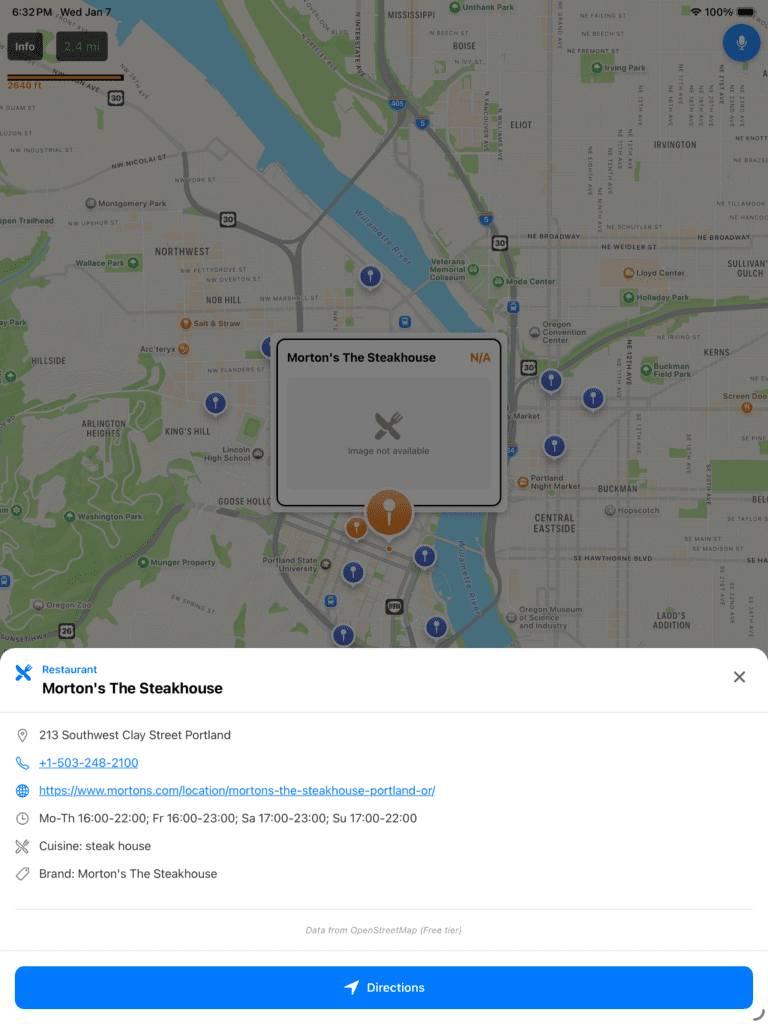
If you click the link you can read more about it.

Where do I get it?
WhereTo is available in the Apple AppStore at https://apps.apple.com/us/app/whereto-by-ideasquantified/id6737565059
WhereTo is available in the GooglePlay Store at https://play.google.com/store/apps/details?id=com.ideasquantified.whereto&hl=en_US
Demo – iOS/Android
This is the demo that Dan Durkin and I sent to YCombinator for the F25 batch. For those unaware, YCombinator is a venture capital company that invests in new ideas and was the financial backer for Reddit, Airbnb, Doordash, Stripe, and many others. Keep in mind that for the purposes of this demo, some further changes have been made to improve the application, but housing data has been removed for now.
While we did not get in, it was an interesting experience applying and pushes you to try to make deadlines happen for the application process. Also, an interesting tidbit, every quarter tens of thousands of people apply making the acceptance rate at approximately 1% which is lower than Harvard’s.
Closing Thoughts
It has been a long journey from August 2024 when I first started building WhereTo until today. Between that time a lot has happened, but within 18 months I managed to create two applications (WhereTo and FactCheck) in an attempt to give another tool to people to help improve their analysis for real world problems.
So that’s that status of WhereTo. Now that it is out there, it is time to get feedback and make improvements. I hope it helps bring some knowledge, learning, and fun getting to view random cities to explore and deep diving into others to enrich your own knowledge. The United States is a big country and yet so many of us know so little about it. This tool helps to bridge that gap some.
Bonus: Unfinished Article “Using Tableau to find ideal Californians Cities”
TL;DR: Built a topographic map of California that is filterable based on dew point, temperature, elevation, precipitation, and even politics.
For a long time I had dreamed of moving to California for a variety of reasons. For me, the math showed a lot of good things about it. It had nice weather, good geography, and an abundance of technology including Tesla. I even ended up buying my first Tesla in 2015 along with stock in the company as a symbol of where I was wanting to go.
Fast forward and I met my wife at my employer who turned out to be a native Californian. Meeting her was kismet. She was going to go back to her home state and I wanted to go that way too so why not do it together? Sometimes, life doesn’t always happen the way you think it will and some plans are put on hold.
We are living in unprecedented times. Throughout the pandemic, many people have been thinking even more deeply about the questions of who they are and what they want. We can see the evidence via the “Great Reshuffling” happening not only at jobs across the country, but also where people choose to live. In theory, anyone should be able to go anywhere they want, but to maximize happiness why not choose to move to a place with the values or criteria you are looking for?
At first, our family considered a large portion of the United States to move to based simply on dew point and safety, but when major health events hit us that made us ponder the question with a shorter timeline. If we only had a short time left to live then it would narrow the focus back to places where we had friends and family. In effect, that way you live your last years at peace knowing you said your goodbyes and can rest with an easy soul. For her, that meant virtually anywhere in California from northern to central to southern. However, for me, I began to reflect back on that earlier dream and if I was going to go to California, where would my ideal city be?
Many good ideas stem from great stories of inspiration. This was mine. While it has taken time to build out my criteria and it grew organically I have come up with the following categories so far.
- Overall Score (Areavibes.com)
- Annual Rainfall in Inches (Bestplaces.net)
- Annual Snowfall in Inches (Bestplaces.net)
- Violent Crime Score (Bestplaces.net)
- Elevation in Feet (Wikipedia.com)
- Average High in July (Weatherspark.com)
- Average Low in December (Weatherspark.com)
- Average Dew Point in July (Weatherunderground.com)
- County Political Party
I started out by creating a Google Sheet with just a few of the criteria. Concurrently, I used Zillow to populate the Google Sheet with cities by looking at different neighborhoods. Whenever I found a house in a city that appeared to meet initial requirements I would go lookup in the sites listed above and populate the city’s related information into the Google Sheet. I have used Python to web scrape and considered doing that, but in the end I told myself that I was only adding a few cities at a time so it seemed to not be as useful.
I was wrong. A year later and I am now past 120 cities across the United States.
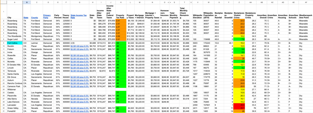
However, for this Tableau dashboard I focused on 38 cities within the state of California. Since California is stereotyped as a democrat stronghold I wanted to see the reality of democrat and republican across the state. To populate this information, I used the 2020 election return results by county and after finding the county information from Wikipedia populated those fields on the Google Sheet too.
For my analysis, I removed major cities such as Los Angeles or San Francisco and focused on the surrounding areas as well as some outlying areas that had some other nice statistics. For example, while it does not reflect it, each of the cities displayed has greatschools.org ratings of at least a 5 or better for K-12 schools for at least part of the city.
While I started gathering data I started to be surprised. One thing that I love about math is that it always tells the truth. So what did I learn?
The first thing I learned was that the Sacramento area is not humid which I assumed it was being so close to the water. As a comparison, the dew point in the Houston Metro area in the month of July is about 74 F. For those unfamiliar, dew point is measured in temperature rather than percentage. It is absolute compared to relative ala humidity. That gives it a relative humidity of about 92%. That means it is what is called wet-bulb.
Even heat-adapted people cannot carry out normal outdoor activities past a wet-bulb temperature of 32 °C (90 °F), equivalent to a heat index of 55 °C (130 °F). The theoretical limit to human survival for more than a few hours in the shade, even with unlimited water, is a wet-bulb temperature of 35 °C (95 °F) – theoretically equivalent to a heat index of 70 °C (160 °F), though the heat index does not go that high.
https://en.wikipedia.org/wiki/Wet-bulb_temperature
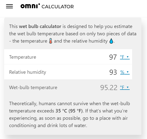
What does this mean? Essentially, if air conditioners were to fail from a power grid failure during that time, something not unheard of with hurricane seasons that are arriving earlier and getting more intense, and if it were 97 F or higher with 93 % humidity or better, conditions which occur regularly, then people can get hyperthermia. Why?
Our bodies sweat to cool off, but, because water evaporates slower in more humid conditions, we cool down a lot slower in humid conditions. This causes our internal body temperature to rise. If the wet-bulb temperature exceeds 35 °C (95 °F) for an extended period of time then people in the surrounding area are at risk of hyperthermia.
https://www.omnicalculator.com/physics/wet-bulb#what-is-the-wet-bulb-temperature
Translation: The loss of human life if power were to fail during the summer for even a short period of time could be even more devastating than the loss of power during the February 2021 Texas freeze.
The next thing I learned was that many of the cities in Northern California near the Sacramento area just simply do not get cold with cold being defined as freezing temperatures of 32 F. For example, take Santa Cruz. In July of 2021, the average high was 68 F and in December the average low was 45 F. From the hottest to the coldest month the temperature only varied by about 23 degrees. In fact, many of the surrounding areas are typical of that with an average low of roughly 40 F.
Also, I discovered that some of the best rated cities and towns were republican suburbs near large, democratic cities. In our Sacramento example, the following cities are highly rated republican areas. Notice how they compare against two highly rated areas in Houston — Sugar Land and The Woodlands. Exclude the Areavibes score as that factors in other values such as cost of living and housing and look more closely at the crime, temperature, and dew point.
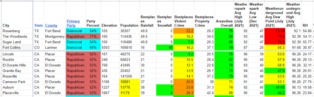
I color coded the fields to make it easier to analyze. For violent crime, if the value is in the top 10%, i.e 10.0 or less on a scale of 1-100 then it was green, yellow is 10.1 to 20.0, and orange is 20.1 to 30. For dew point, if it was 50 F or less, then it was green while from 50.1 to 60.0 was yellow and 60.1 to 70.0 was orange. Anything above that was considered red.
What we can see is that the majority of those areas are all very close in their stats and all very good places to live. 5 of the 8 are even safer than The Woodlands. Also, those same 5 cities have far lower dew points meaning they feel more comfortable outside with 2 of the 8 even getting snow.
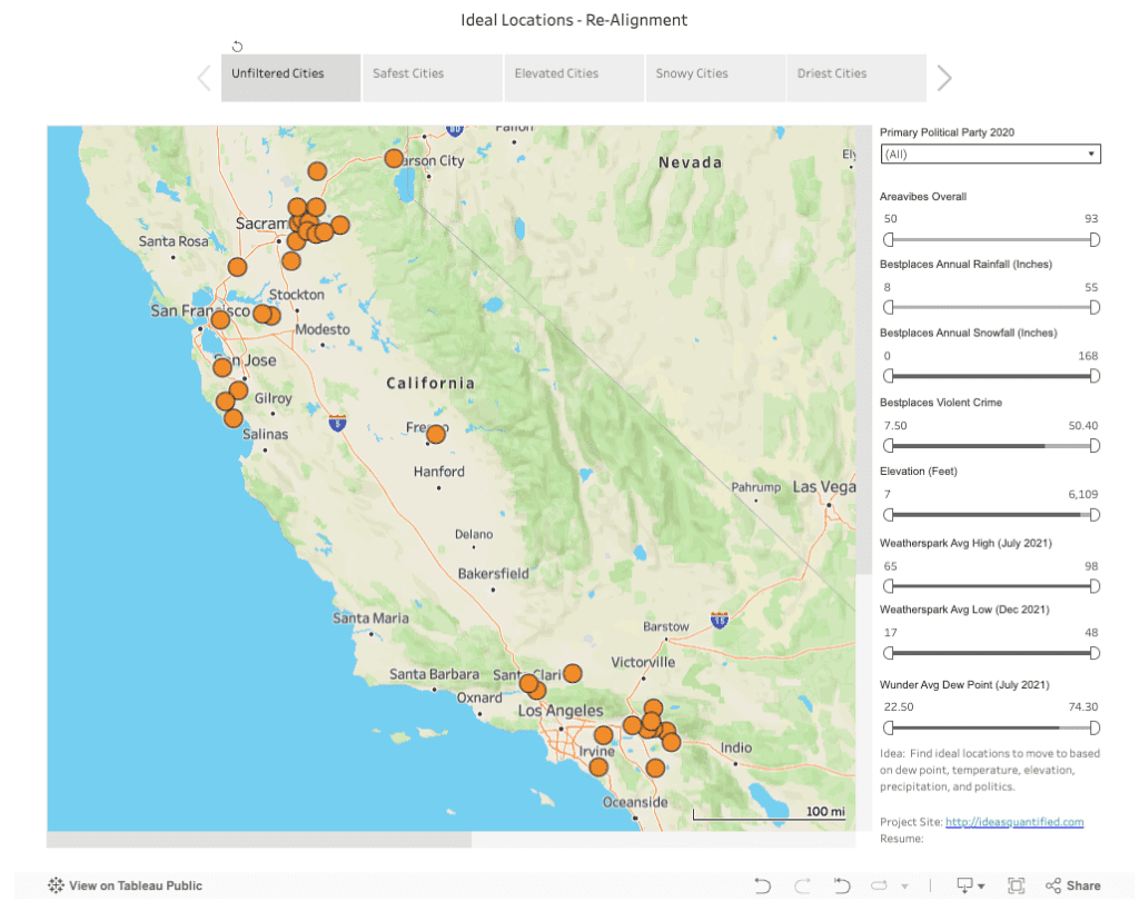
Okay, so I have a spreadsheet that I populated with data. Now let’s see how that looks on a map when it is plotted inside Tableau using geography as an overlay. This way you can play along too. Simply click the links or slide the minimum and maximum values to find your ideal spots.
The tabs at the top are predefined dashboards that I used to show quick pieces of information. However, everything is filterable. Safest cities is defined as being as equal or safer than The Woodlands. Elevated cities have heights over 1,000 feet. Note, it is not until you hit 3,500 feet or higher that you need to adjust your cooking times. This is also when increased risks of certain blood conditions can occur such as thrombosis. Snowy cities is defined as having at least 1 inch of snow in December and driest cities are areas with a July dew point of 55 F or less as well as annual rainfall at 30 inches or less.
References: